Candelaria
2025
About Candelaria
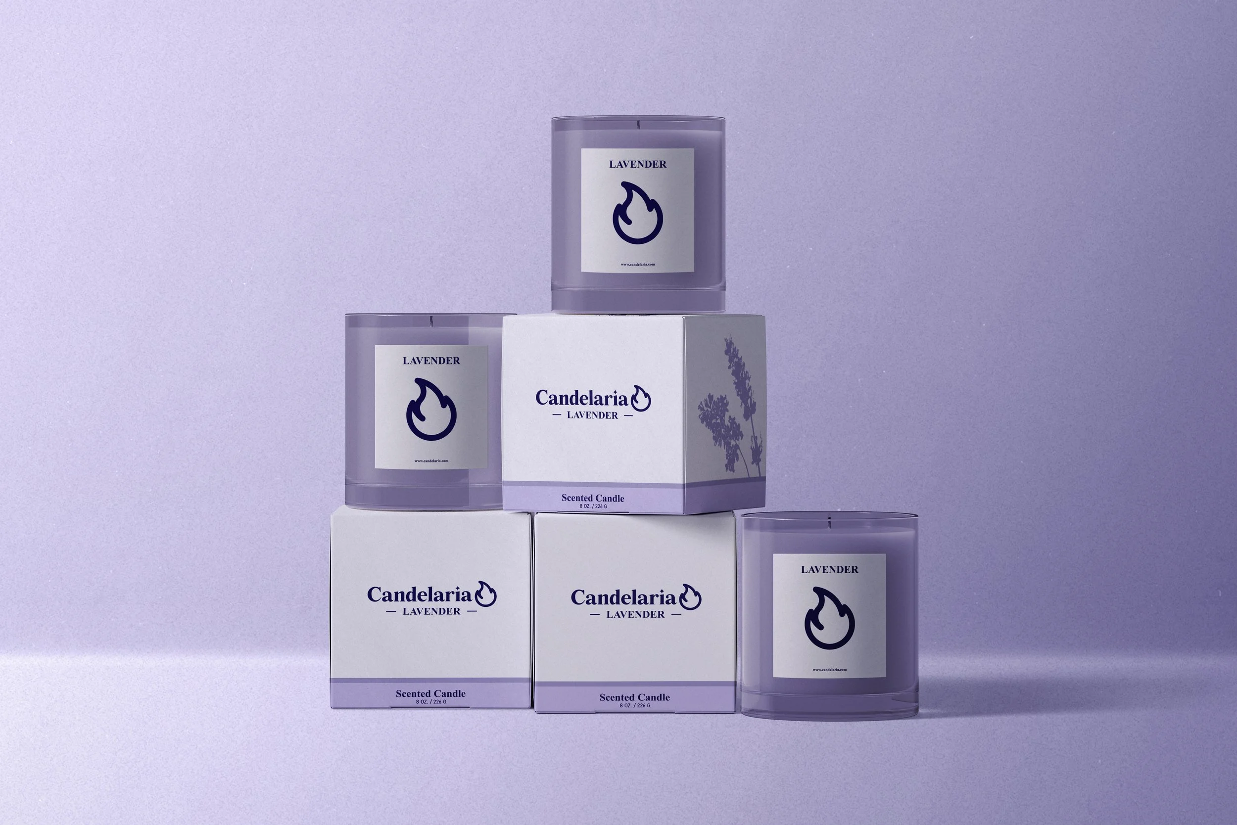
Candelaria is a concept project for a minimalist contemporary candle brand specializing in floral scents.
Project Scope
Logo, Branding, Mockup, Packaging Design
The Challenge
The challenge of this project was to create a visual identity for a contemporary candle brand that feels calm and refined without becoming sterile or generic. The brand needed to communicate a sense of ritual and warmth while maintaining a minimalist aesthetic that could stand out in a saturated market. The design had to feel intentional and premium, using restraint rather than decoration to convey mood, scent, and brand personality.
Design Approach
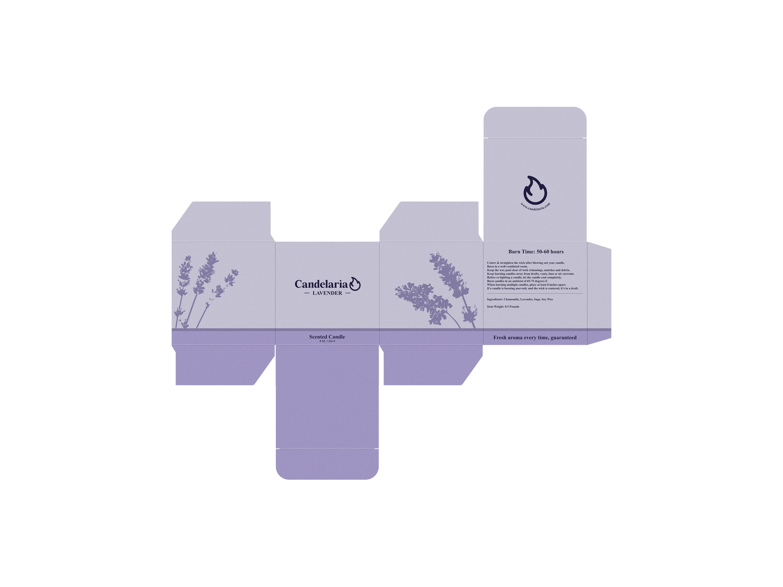
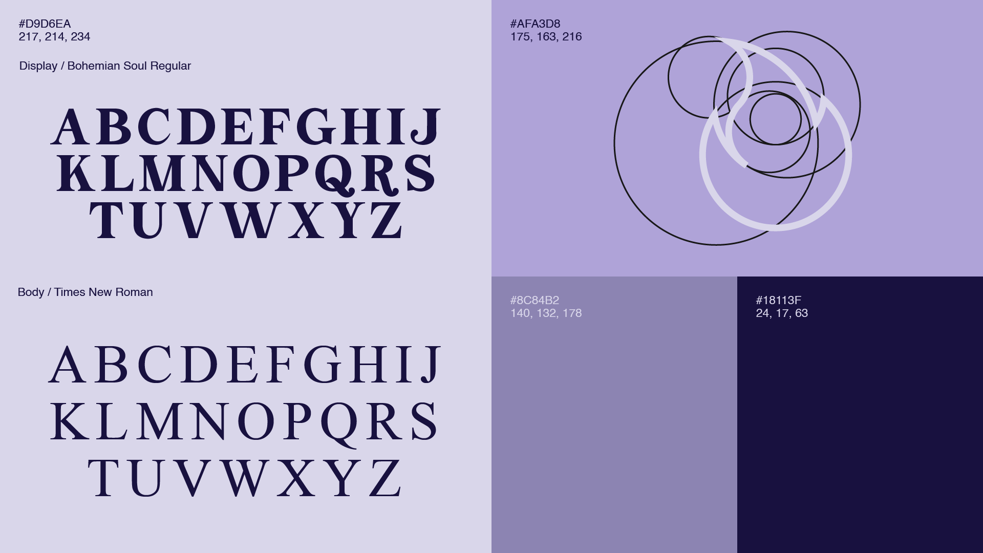
The design approach focused on building a cohesive visual system rooted in simplicity and balance. A muted lavender color palette was selected to directly reference the candle’s floral scent while reinforcing feelings of calm and softness. Typography was kept classic and legible, pairing expressive display letterforms with restrained body text to create contrast without visual noise.
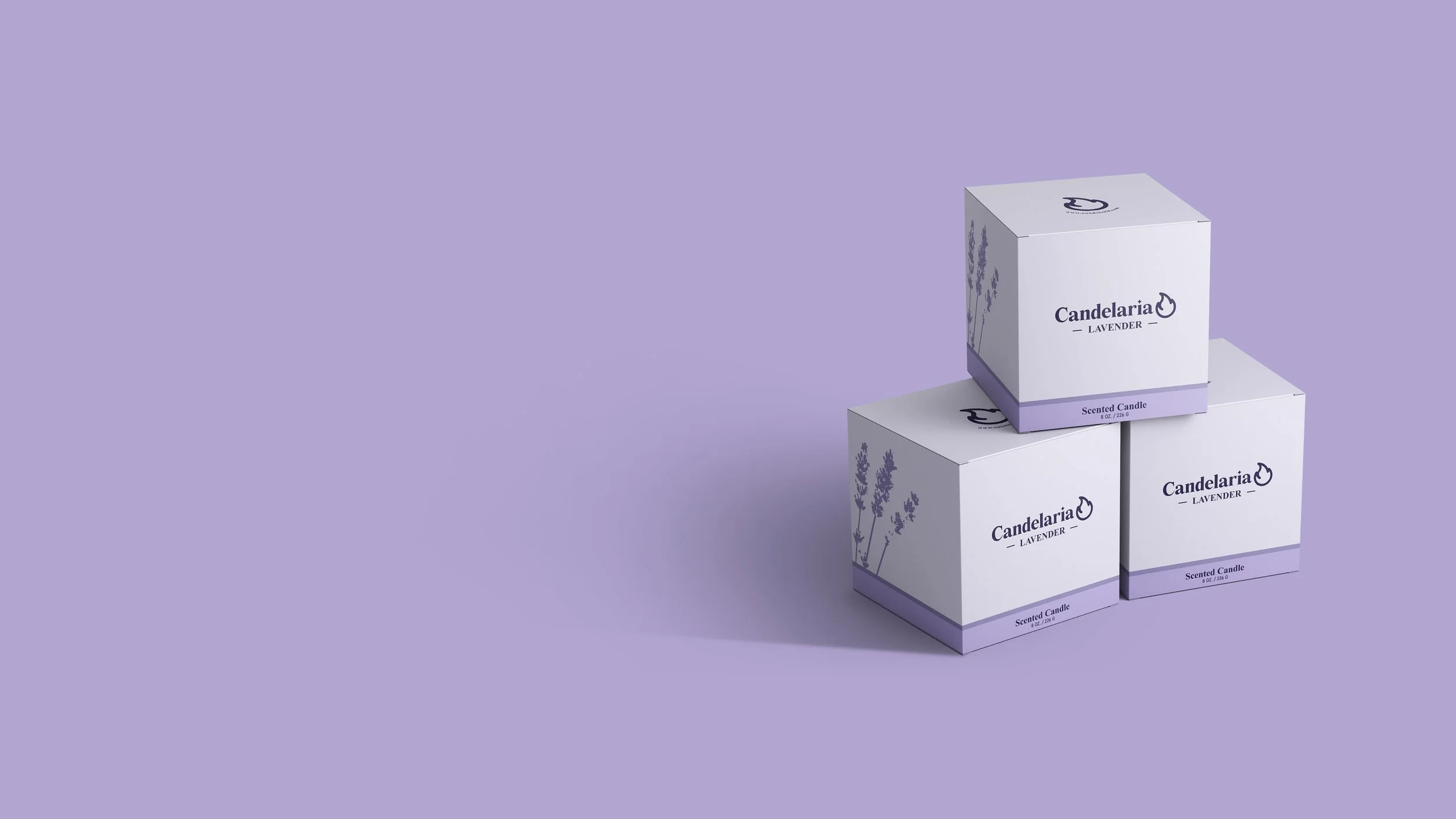
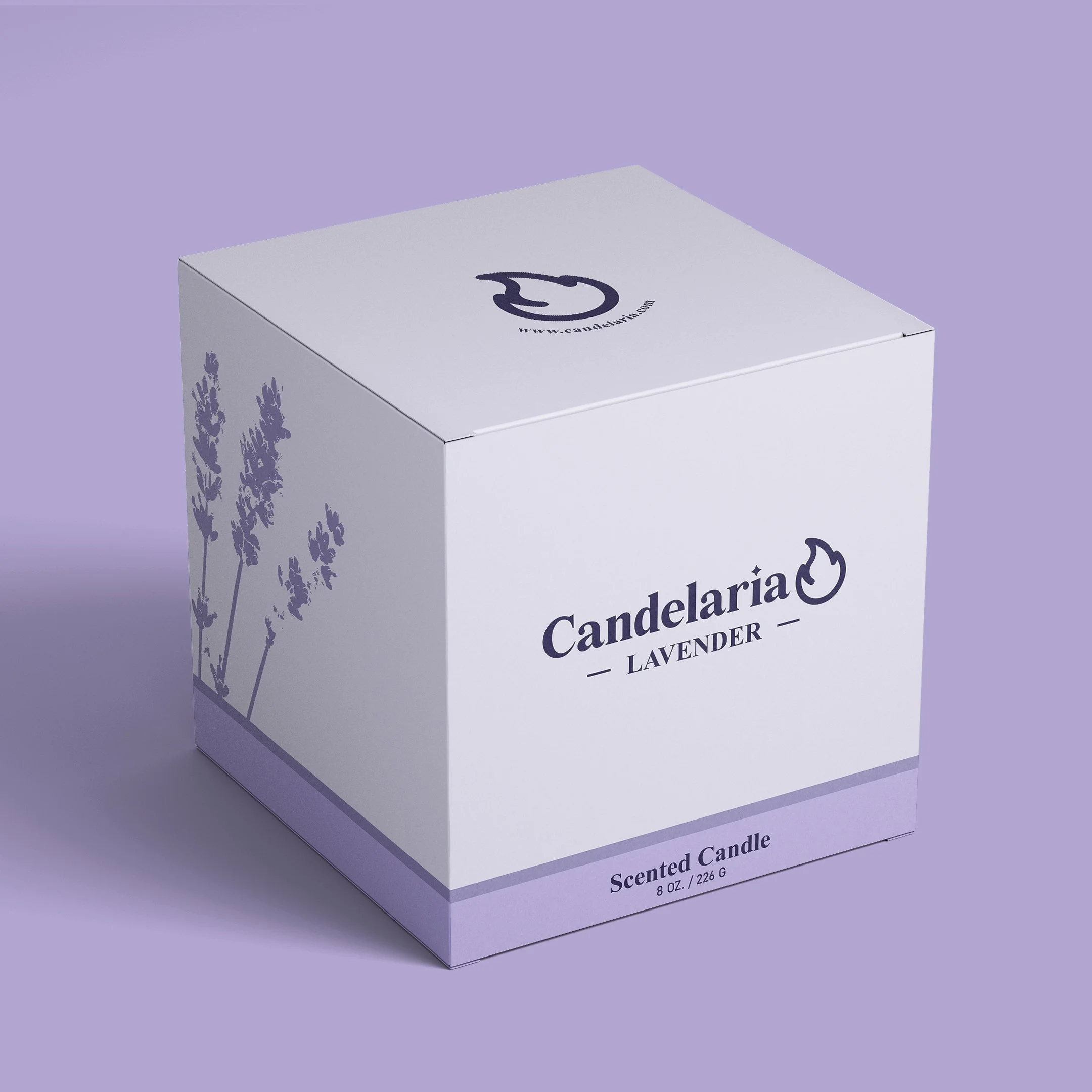
The Candelaria logo was constructed using circular forms and smooth curves, resulting in a minimal flame mark that feels dynamic yet controlled. Subtle botanical illustrations and generous negative space were incorporated into the packaging layout to add visual interest while preserving clarity. Together, these elements form a flexible system that translates consistently across packaging, dielines, and brand applications.
The packaging uses clean alignment, understated labeling, and ample spacing to create a refined and calming presence without relying on excessive ornamentation. Frosted containers and muted tones help reinforce the product’s floral inspiration while giving the brand a more elevated and contemporary appearance. The contrast between delicate serif typography and the simplified flame symbol creates a balance between elegance and clarity, allowing the branding to feel both expressive and highly functional.
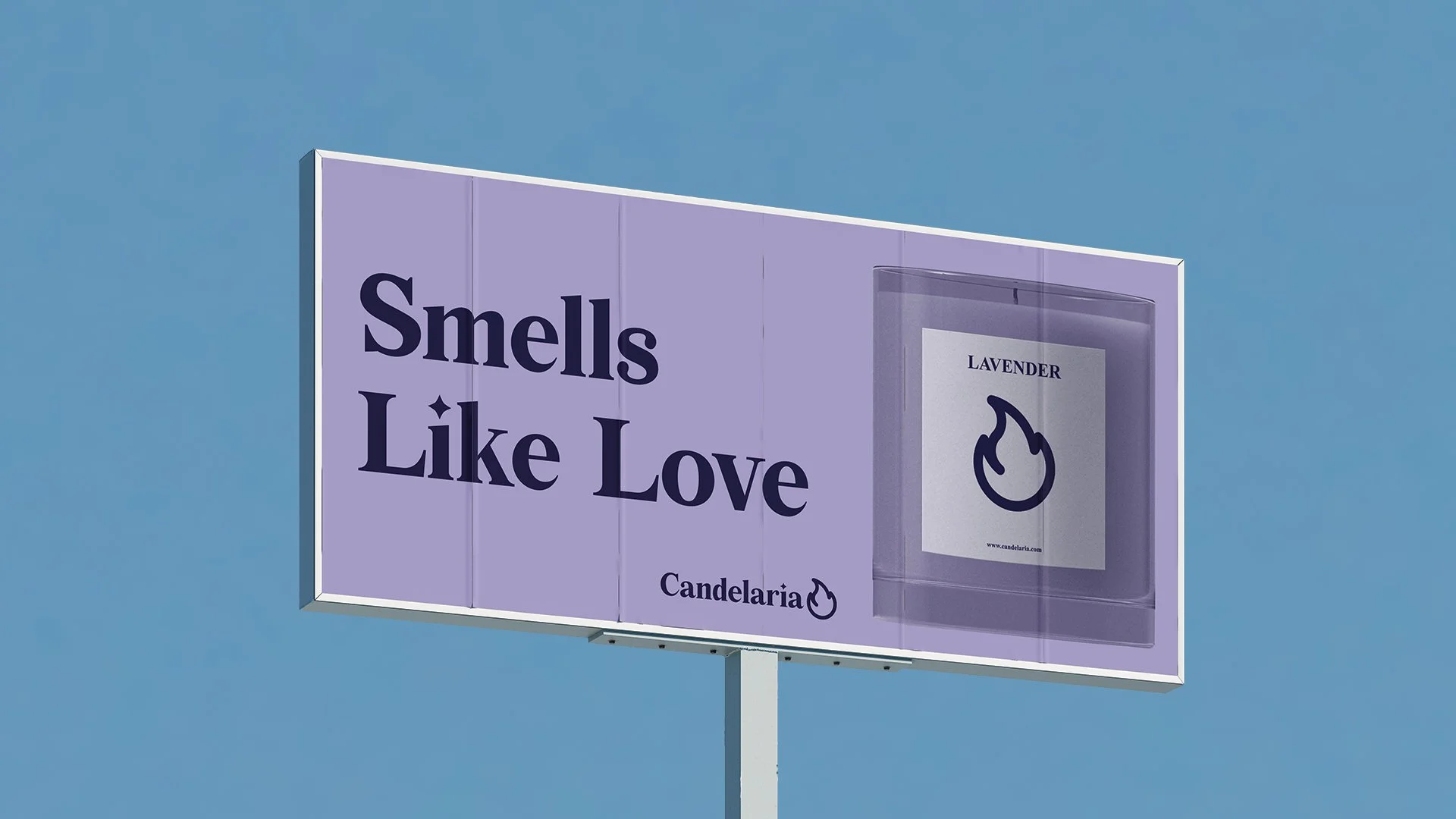
The visual system was intentionally kept flexible so it could adapt naturally across product lines, seasonal scents, and digital applications while maintaining a consistent tone. Across the packaging and mockups, the emphasis remained on creating a calm visual rhythm through proportion, spacing, and subtle repetition rather than decorative complexity.