Heraxet
2026
About Heraxet
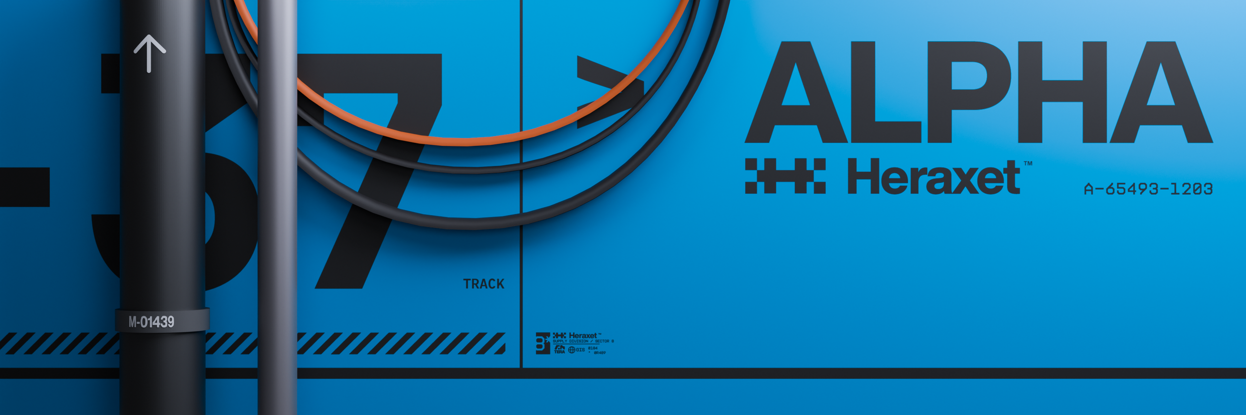
Heraxet is a passion project where I designed a company that fits into the Marathon game universe.
Project Scope
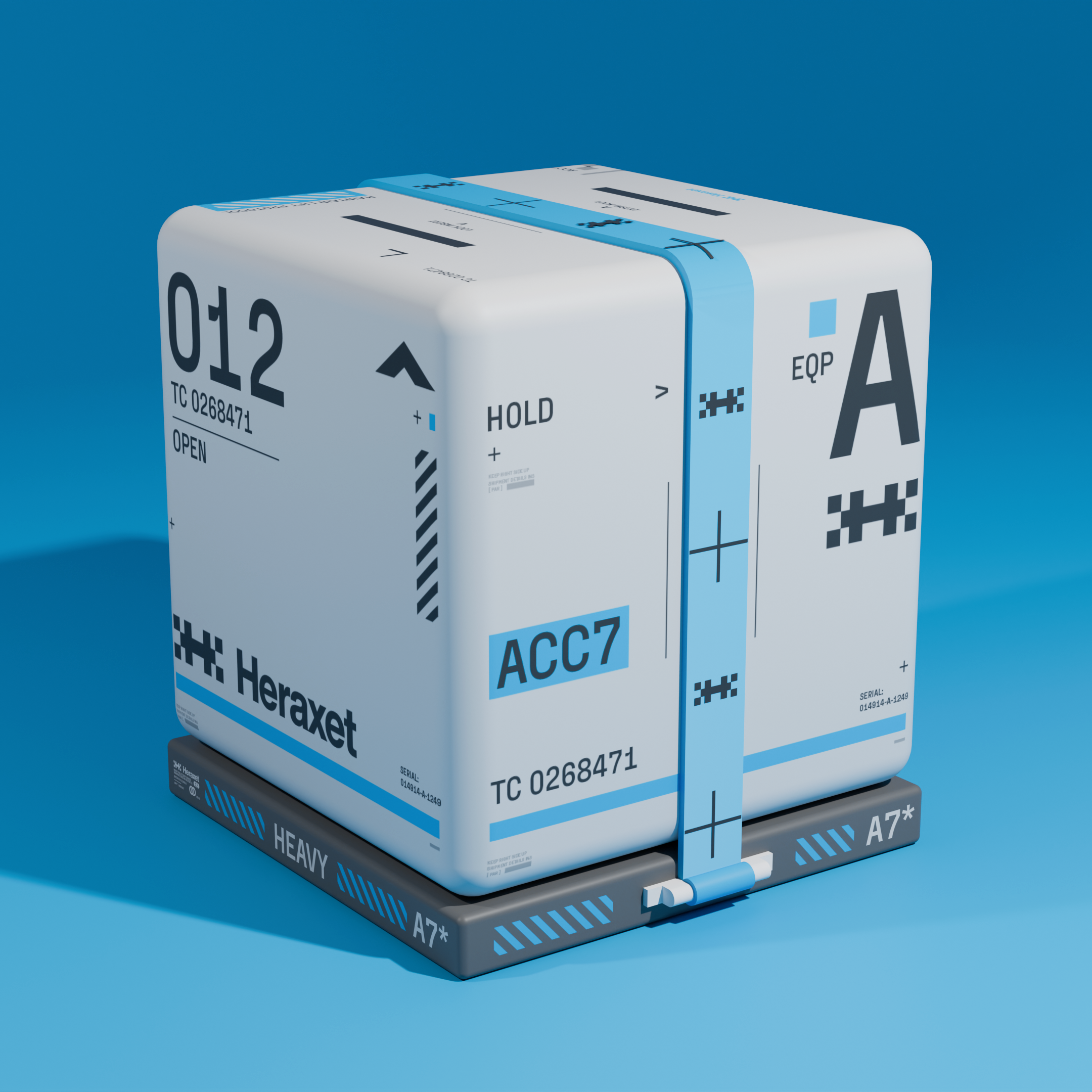
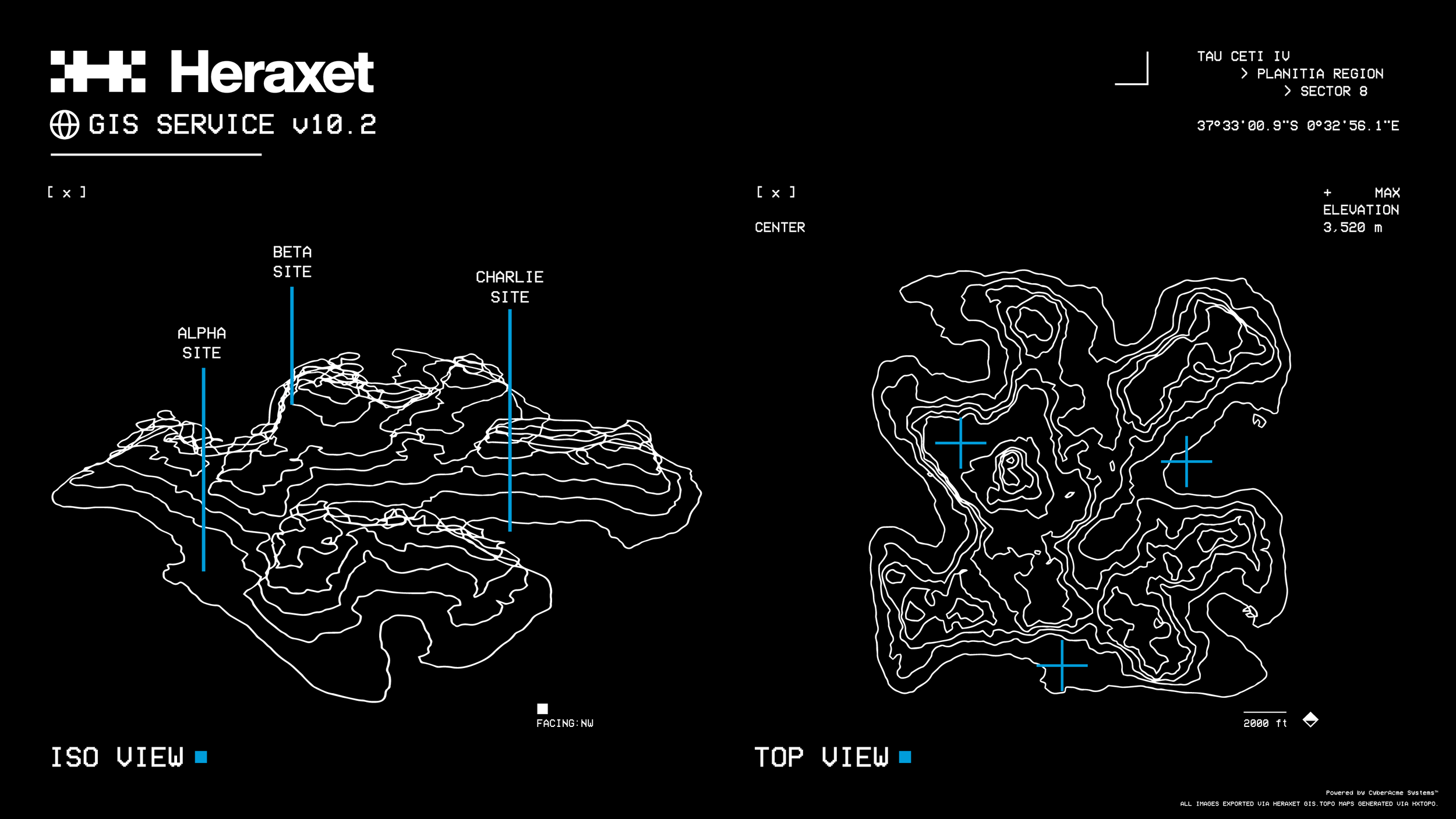
Logo, Identity, Branding, Mockup, Motion Graphics
The Challenge
The challenge of developing Heraxet was to create a complete brand identity that felt authentic to Marathon’s established visual language while remaining distinctive enough to stand alongside its existing companies. The identity needed to feel as though it belonged within an already developed corporate ecosystem, adhering to its visual conventions without becoming derivative of the other factions. At the same time, Heraxet needed to establish its own recognizable presence, communicate the character of an entirely new industry, and maintain consistency across its various applications. The goal was to strike a balance between fitting an established system and introducing something entirely new.
Design Approach
Developing Heraxet began with an in-depth analysis of Marathon’s six established factions and their respective visual identities. This research focused on identifying the recurring design characteristics and visual conventions used throughout the game's corporate branding. Each company was examined in terms of its logo construction, typography, color palette, graphic elements, and overall aesthetic to better understand how these individual identities were developed and how they functioned within the broader visual system. Establishing Heraxet’s foundation also required defining its role within the game’s corporate landscape. The company was conceptualized as a multiplanetary industrial and construction megacorporation, occupying a sector not otherwise represented by the existing companies.
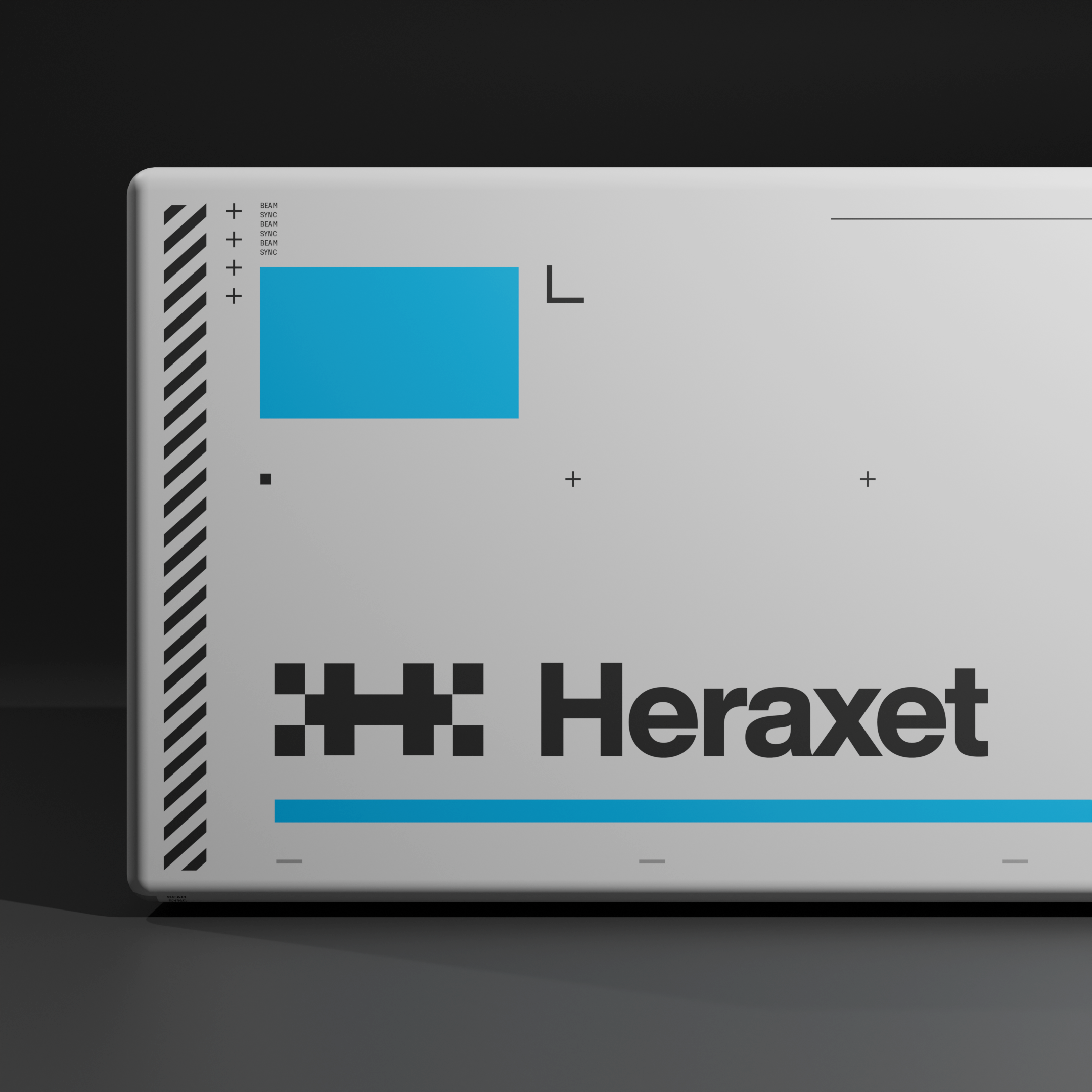
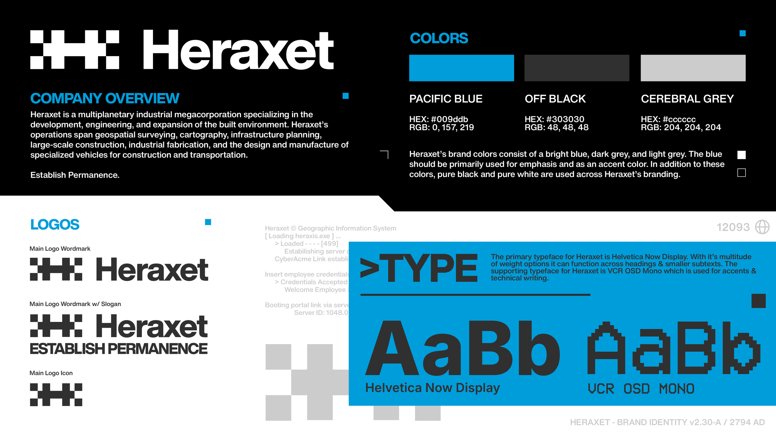
The primary logo was developed around the same geometric principles found throughout Marathon’s faction identities. An analysis of the existing marks revealed a preference for simple geometric forms, particularly squares, rectangles, and circles, alongside common 45° and 90° angles. Using these principles as a foundation, the Heraxet symbol was constructed from a series of squares arranged on a consistent grid, forming an abstract combination of the letters H and X. The result was designed to remain visually distinct and recognizable while maintaining the same geometric simplicity as the other faction logos. Color selection required similar consideration, as each of the established companies already occupied a distinct position within the game's color system. To avoid visual overlap, a saturated Pacific blue was selected as the primary brand color, supported by a monochromatic grayscale palette. Typography followed the same approach, with a bold sans-serif wordmark and Helvetica Now Display serving as the primary typeface, reflecting the corporate and utilitarian qualities of Marathon’s existing identities. VCR OSD Mono was introduced as a secondary typeface for technical markings, interface elements, and supporting graphics. Finally, the slogan "Establish Permanence" was developed to reflect the commanding and slightly dystopian tone characteristic of the game's other corporations. Together, these decisions established an identity that could stand independently while remaining consistent with the broader visual language of Marathon.