Monvel
2026
About Monvel
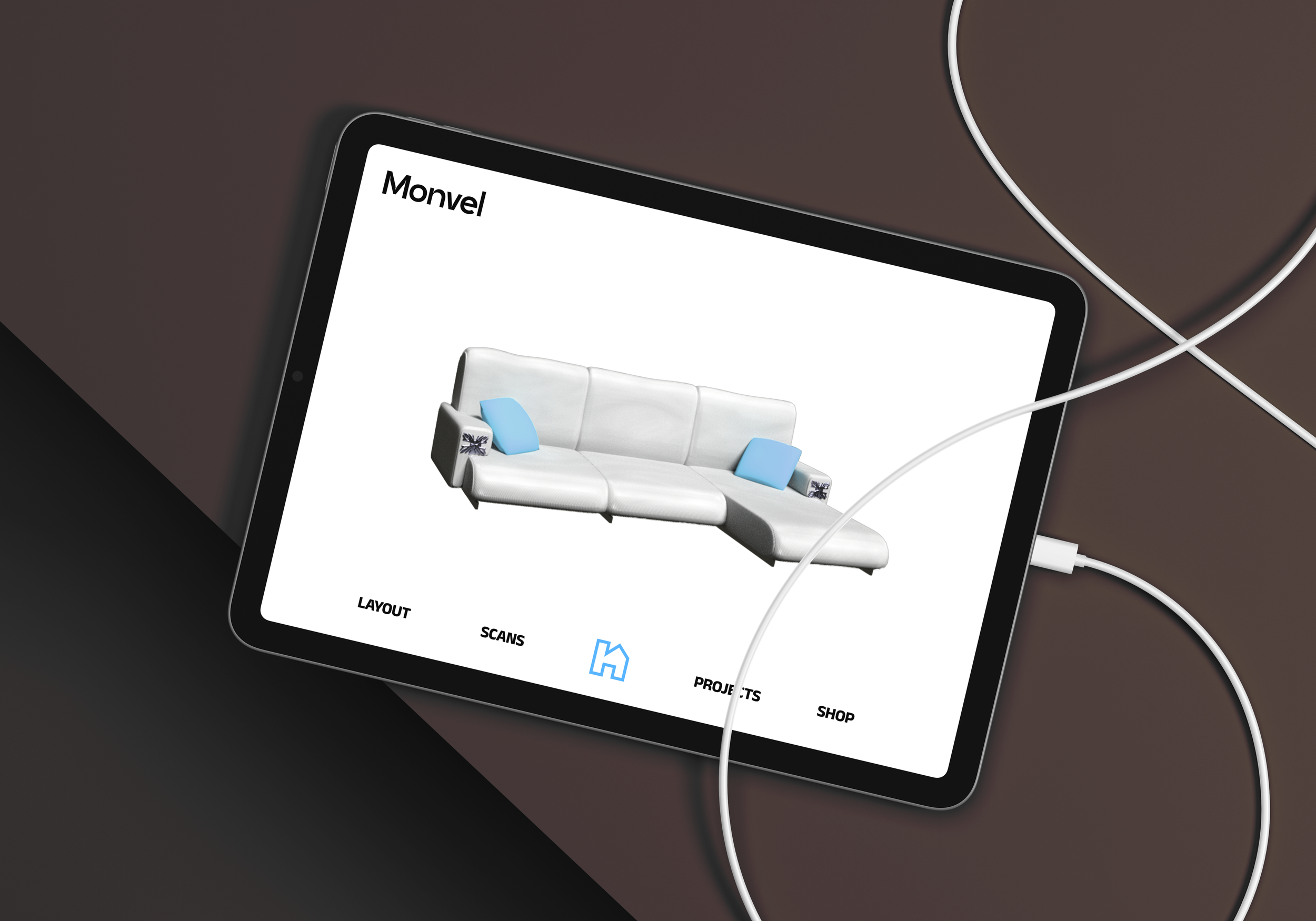
Monvel is a concept interior design firm. Monvel’s services range from consulting for furnishing and decorating interiors, to AR (Augmented Reality) mobile apps for interior design, and monthly newsletters/magazines.
Project Scope
Logo, Identity, Branding, Mockup
The Challenge
The challenge of this project was to create a visual identity for an interior design brand that feels contemporary and refined while remaining adaptable across both physical and digital experiences. Monvel needed to communicate professionalism and trust without relying on the overly luxurious or ornamental aesthetics commonly associated with interior design firms. Because the brand extends beyond traditional consulting into digital products such as AR-based interior design tools and editorial content, the identity system also had to function clearly across mobile interfaces, printed materials, and environmental applications. The goal was to develop a brand that feels clean and modern while still conveying warmth, sophistication, and a strong sense of space.
Design Approach
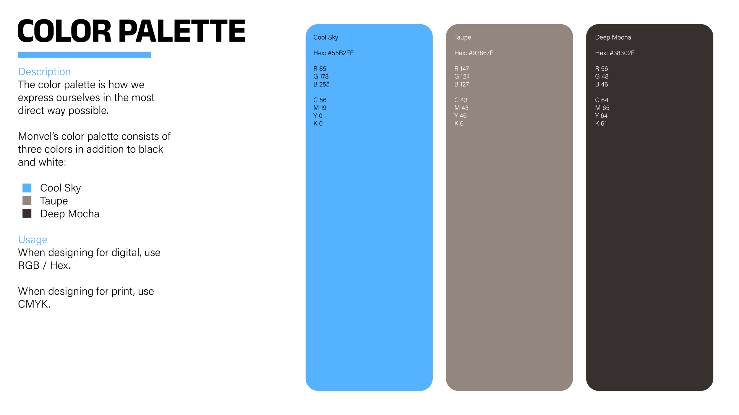
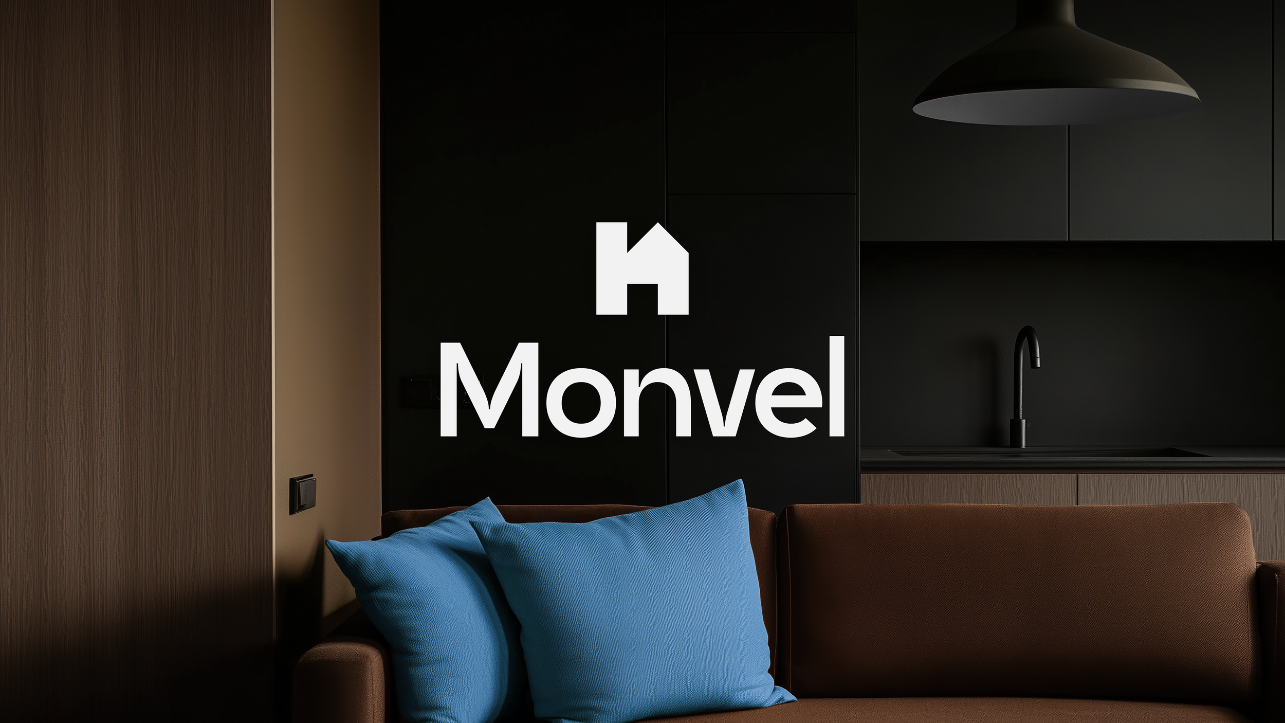
The design approach focused on creating a visual system built around simplicity, structure, and atmosphere. The identity shown in the brand guidelines uses a restrained palette made up of cool blue, taupe, deep mocha, black, and white to create contrast while maintaining a calm and contemporary tone. Rather than using bright or highly saturated colors, the palette was chosen to feel grounded and architectural, allowing photography and spatial imagery to become a primary part of the brand language. The blue accent color acts as a recognizable visual anchor throughout the system and helps separate Monvel from the neutral-heavy aesthetics often seen within the interior design industry.
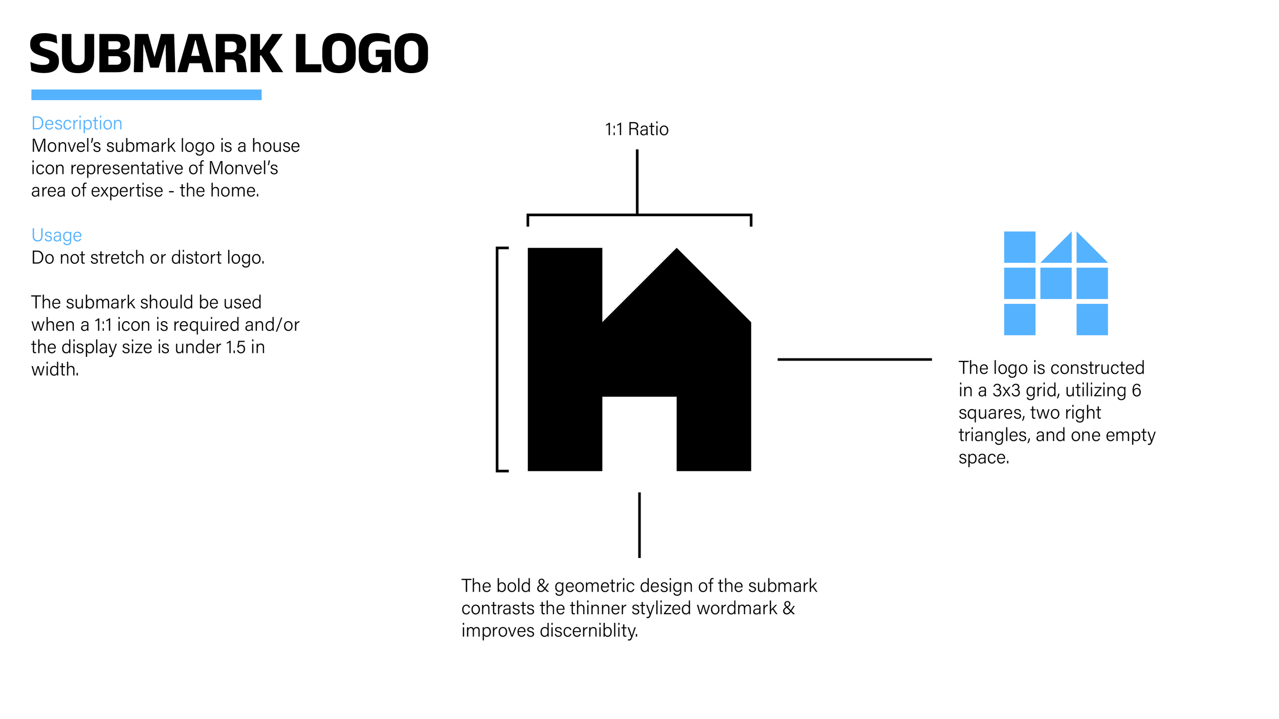
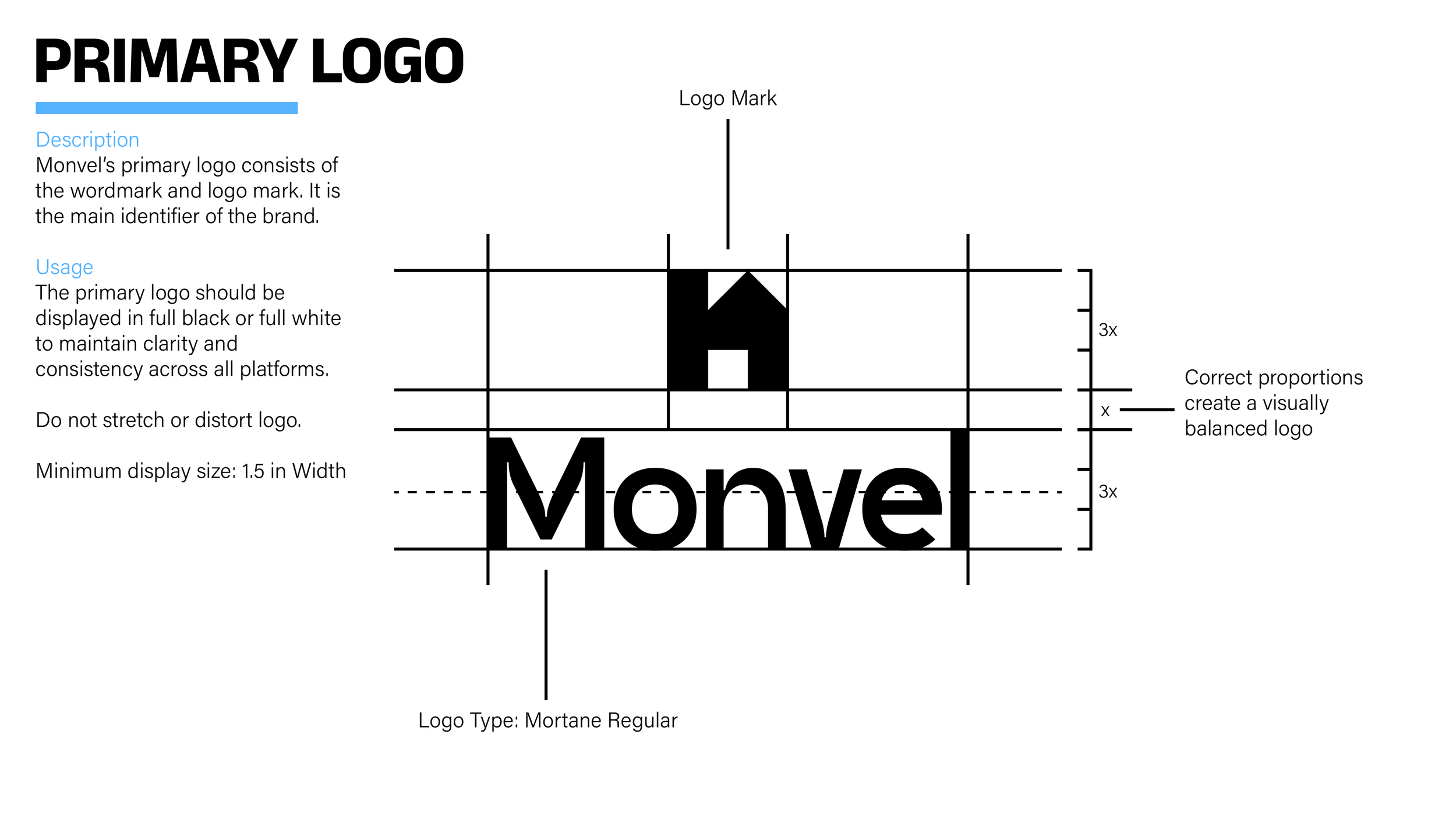
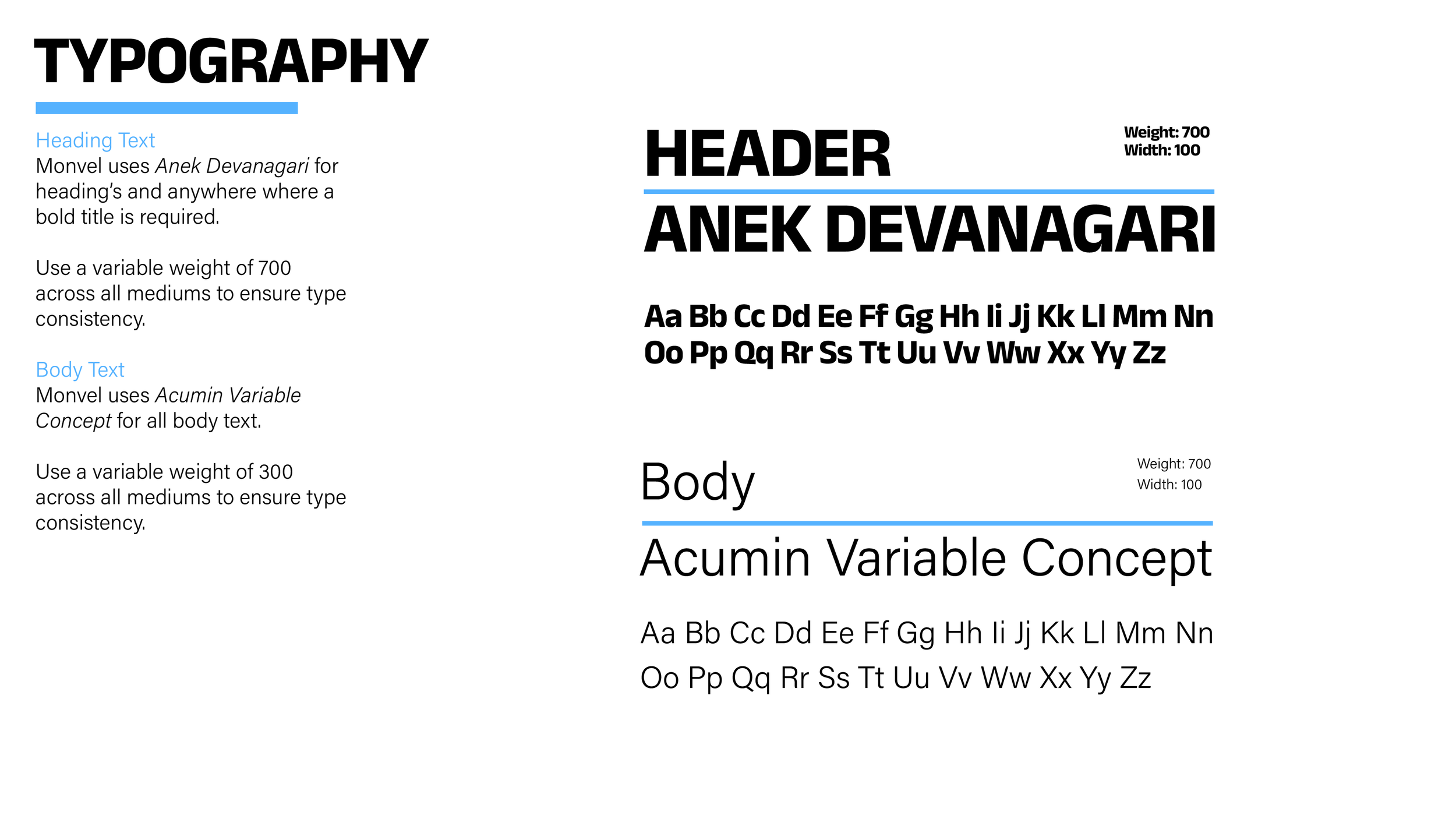
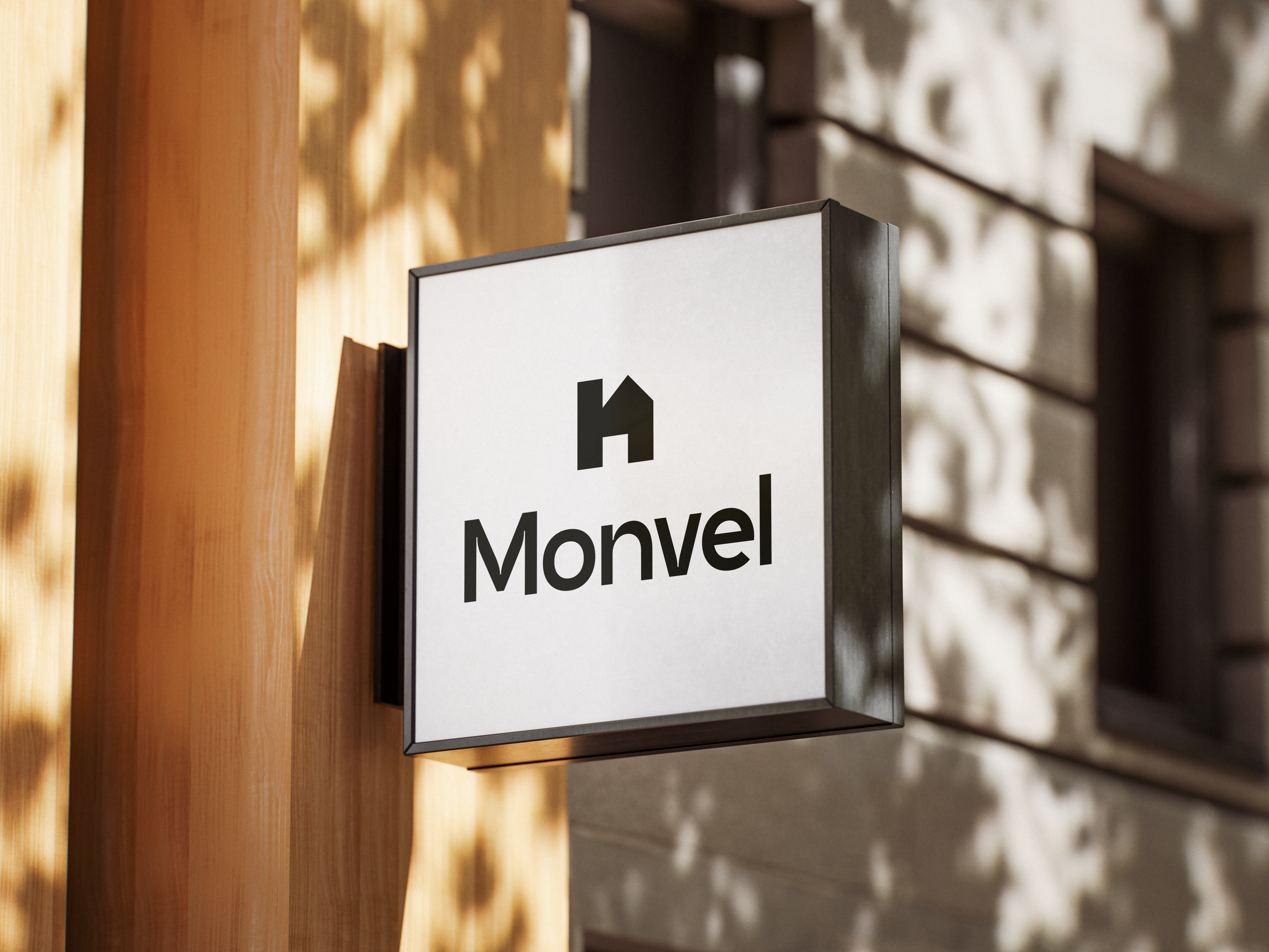
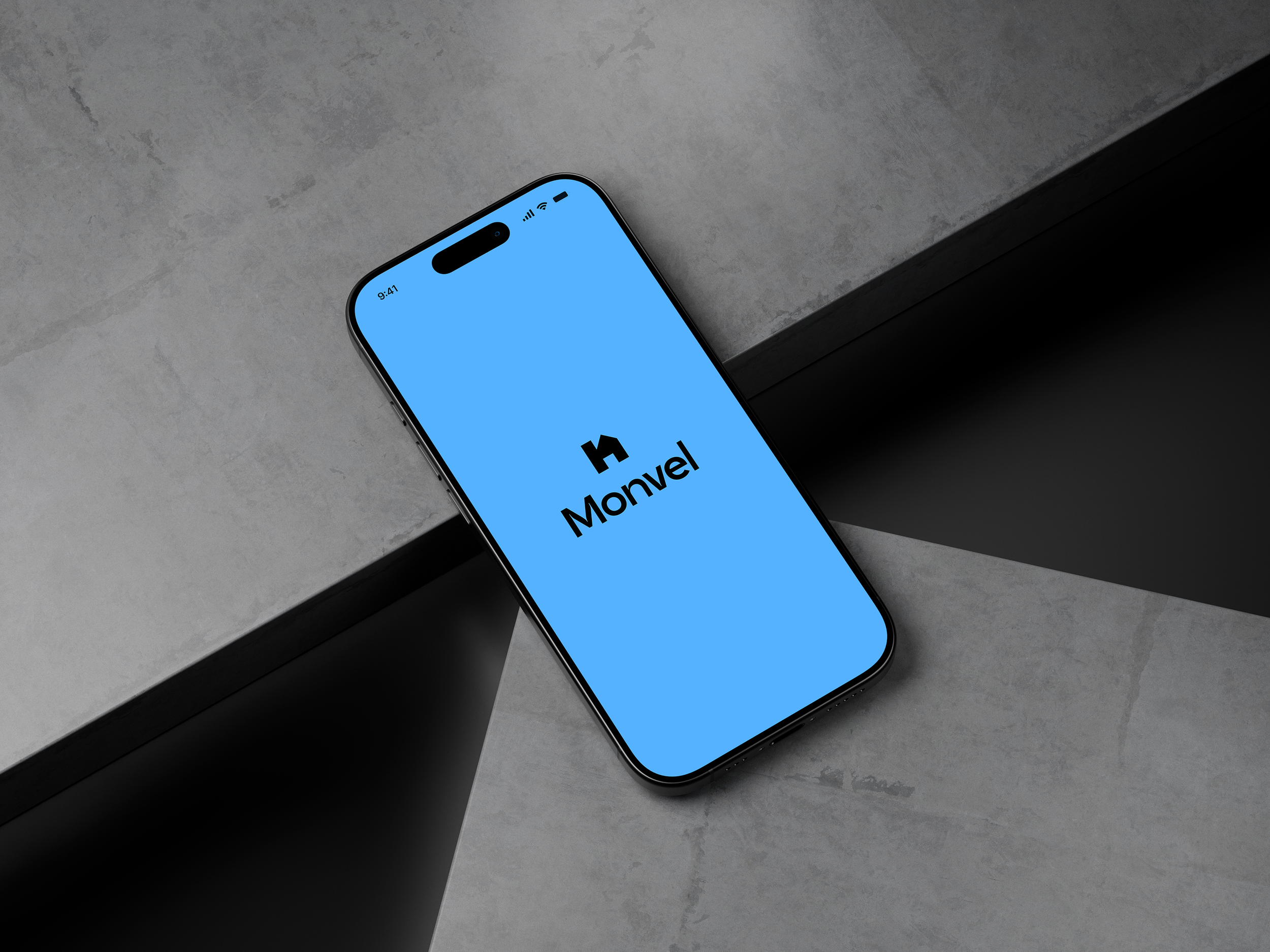
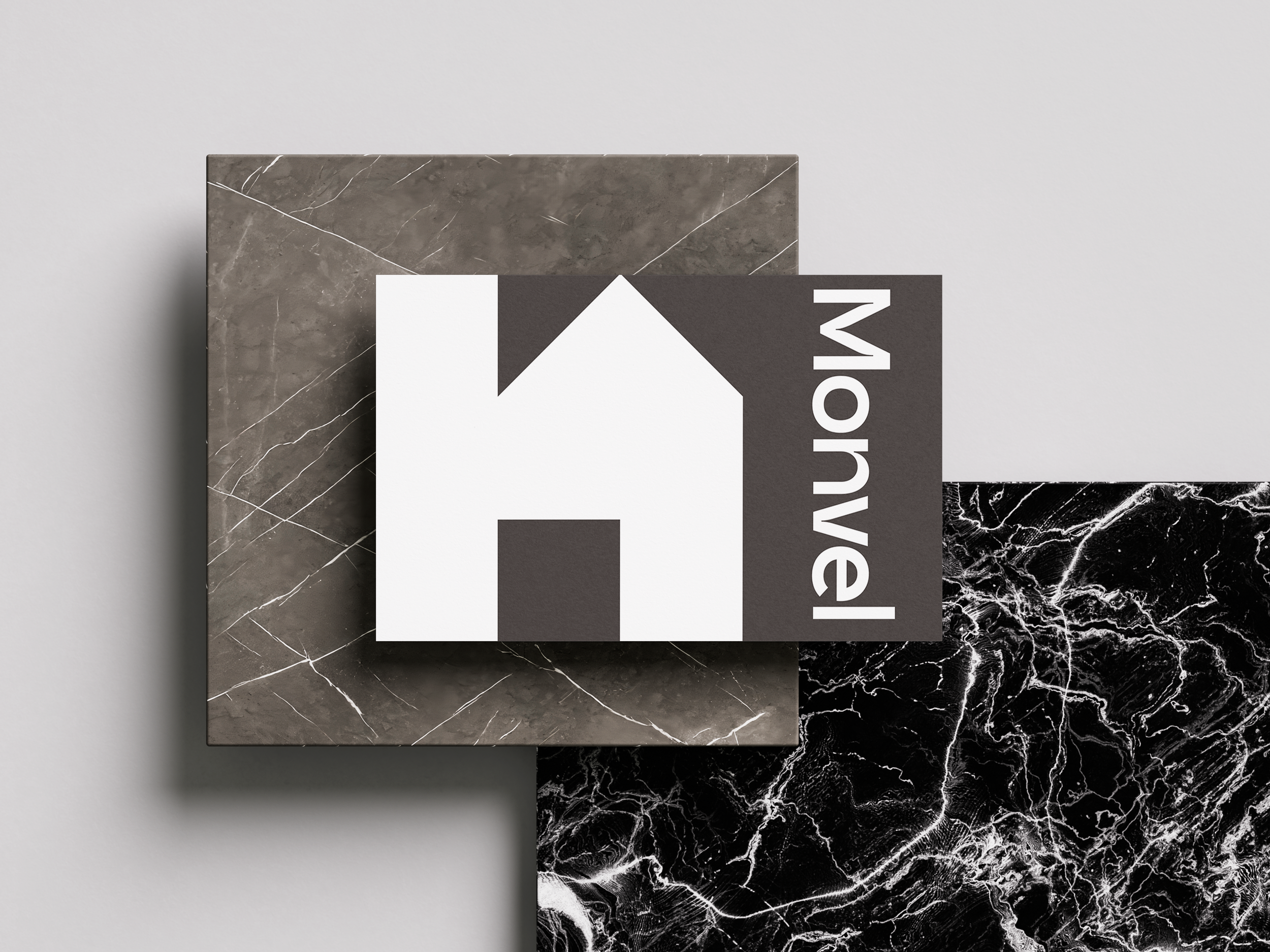
Typography was approached with clarity and flexibility in mind. The combination of Anek Devanagari and Acumin Variable creates a balance between bold presentation and functional readability, allowing the identity to scale naturally across print layouts, mobile interfaces, social content, and editorial applications. Large headings and geometric forms establish confidence and structure, while the lighter body typography keeps layouts open and approachable. The logo itself was designed around simplified architectural forms, using a minimal house-inspired mark that feels modern without becoming overly literal. Its geometric construction allows it to remain highly recognizable across small digital applications as well as larger environmental branding.
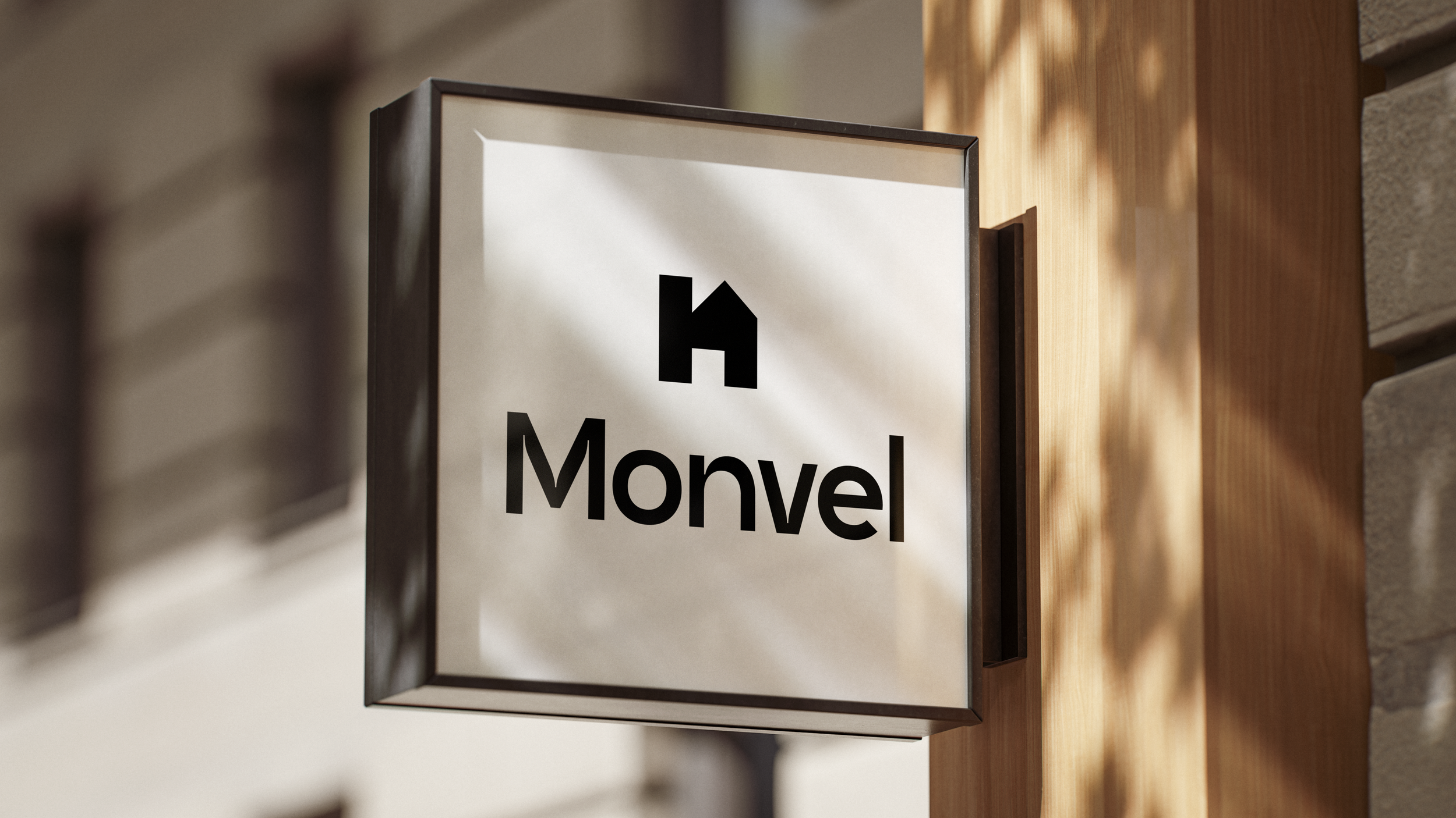
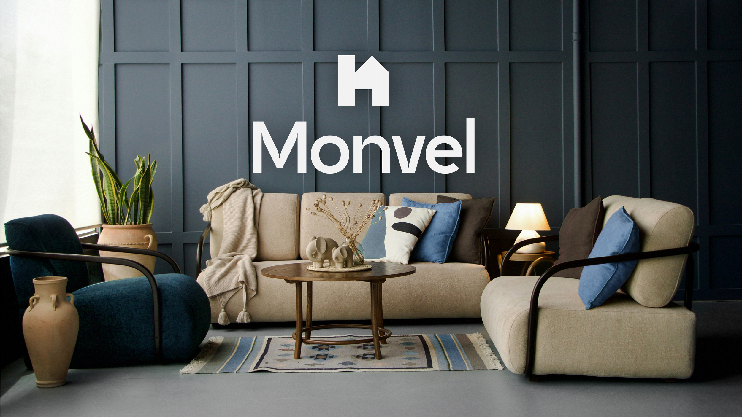
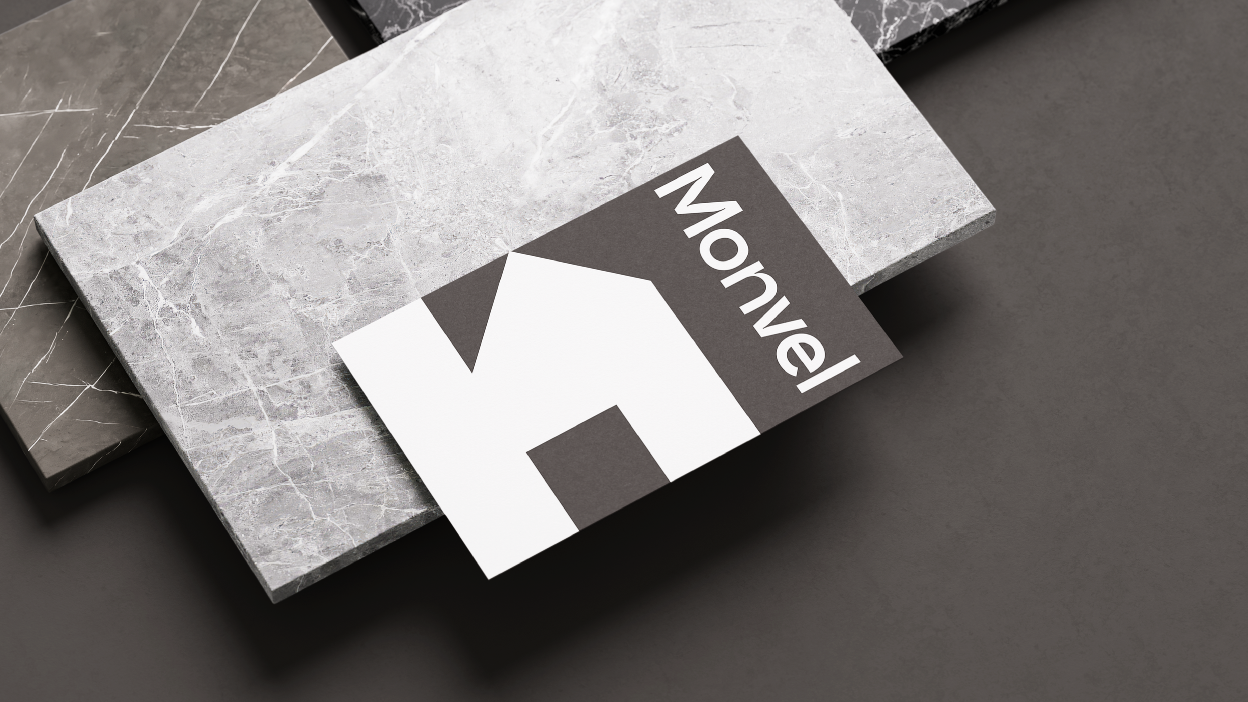
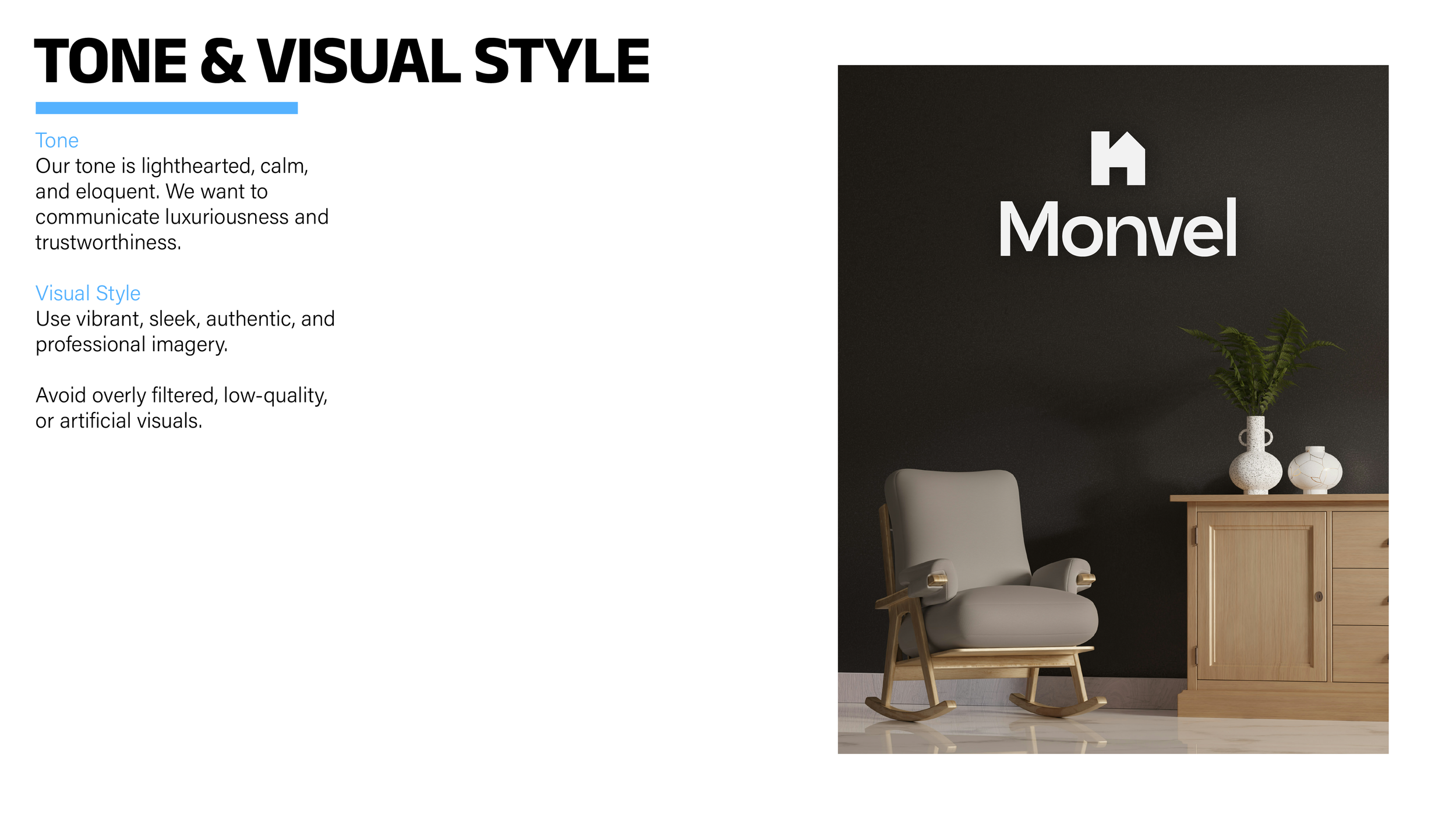
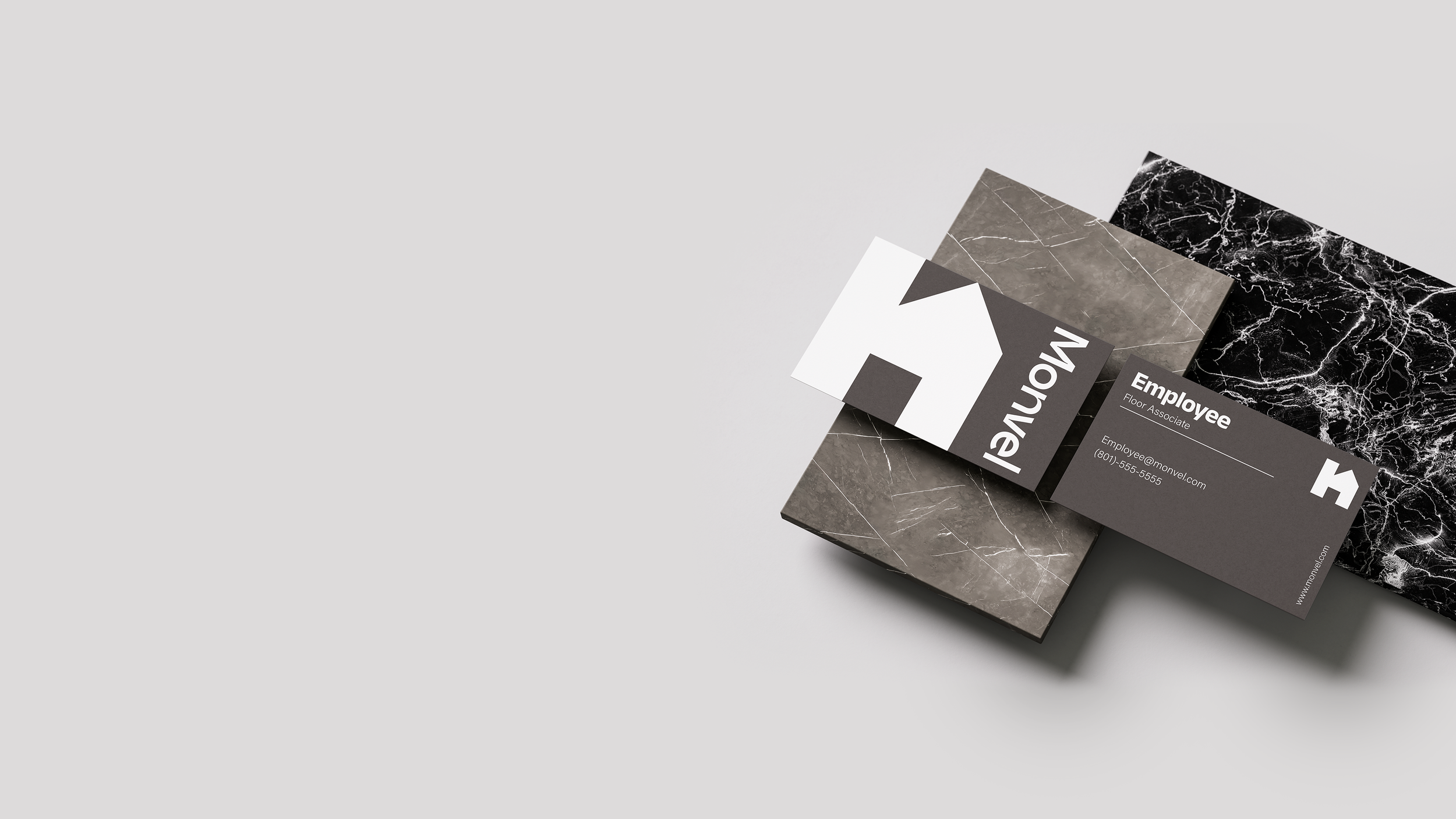
Photography and mockups were treated as a core part of the identity system rather than secondary assets. The advertising direction uses moody, high-contrast interior imagery with controlled lighting and minimal compositions to reinforce the brand’s calm and polished tone. Supporting applications such as the business cards and environmental signage continue this approach through generous spacing, clean alignment, and minimal graphic interruption. Together, these elements create a cohesive brand system that feels equally suited for interior consultation, digital design tools, and modern editorial content.