Telar
2026
About Telar
Telar is a concept camera-equipment brand specializing in high-end optics & accessories.
Project Scope
Logo, Identity, Branding, Packaging
The Challenge
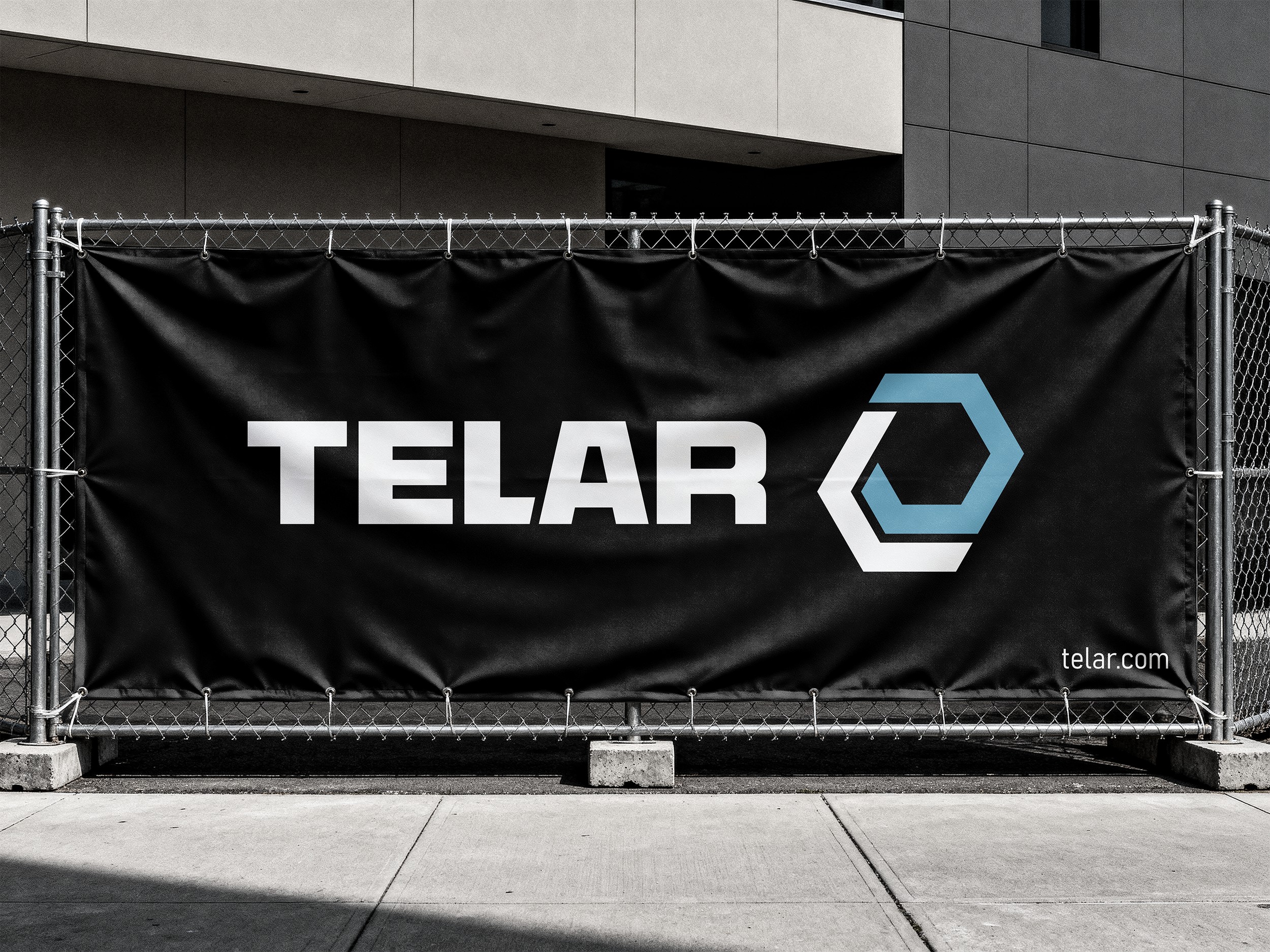
The challenge of this project was to develop a visual identity for a high-end camera equipment brand that felt technical, modern, and premium without losing clarity or approachability. Telar needed to appeal to photographers and filmmakers who value precision and performance, while also standing out in a market heavily dominated by overly complex or traditional tech branding. The identity system had to feel bold and recognizable across multiple applications, from packaging and brand guidelines to large-scale environmental graphics. A major focus was creating a clean, high-contrast aesthetic that communicated durability and quality through restrained color, strong typography, and minimal visual noise.
Design Approach
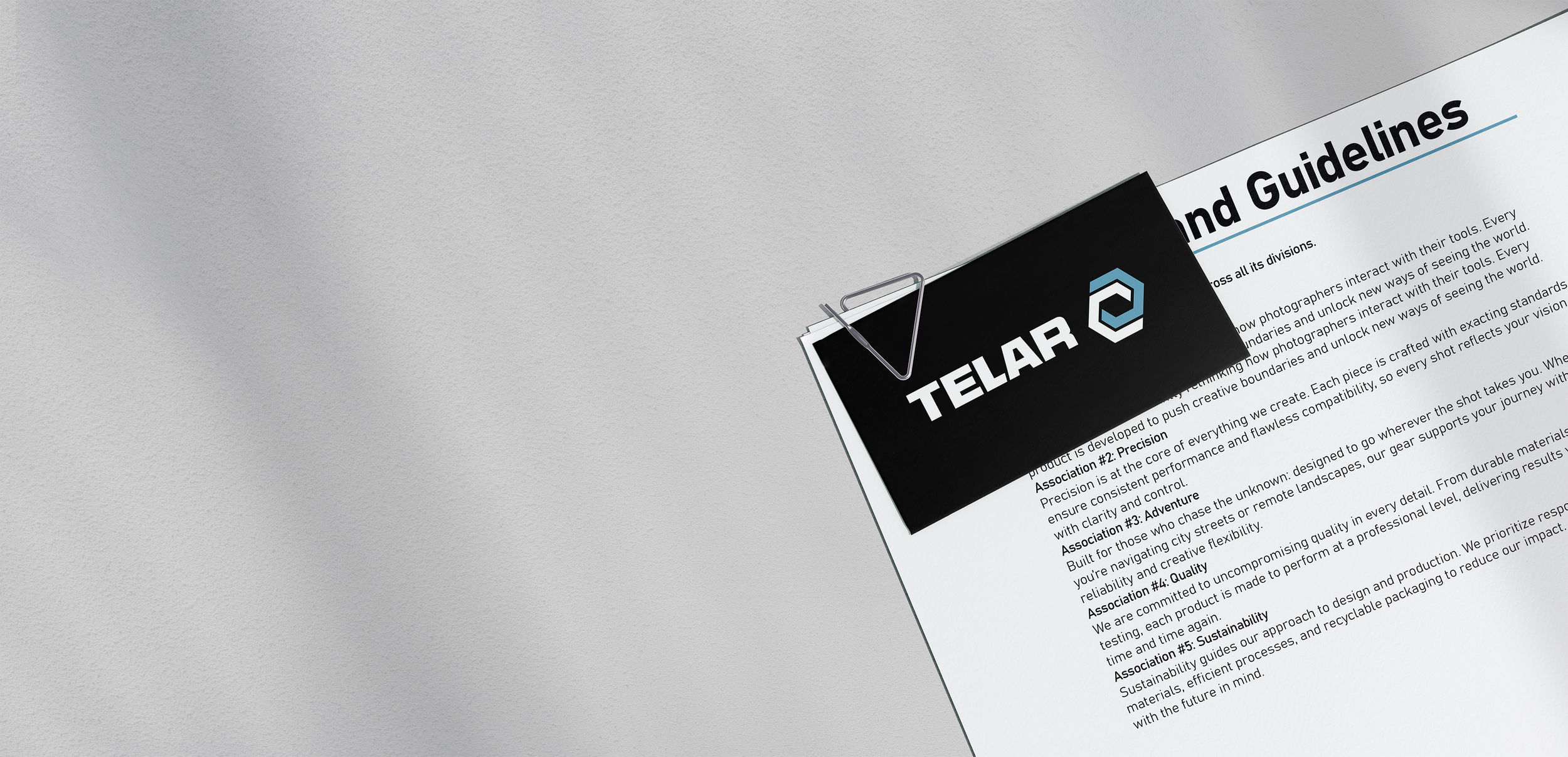
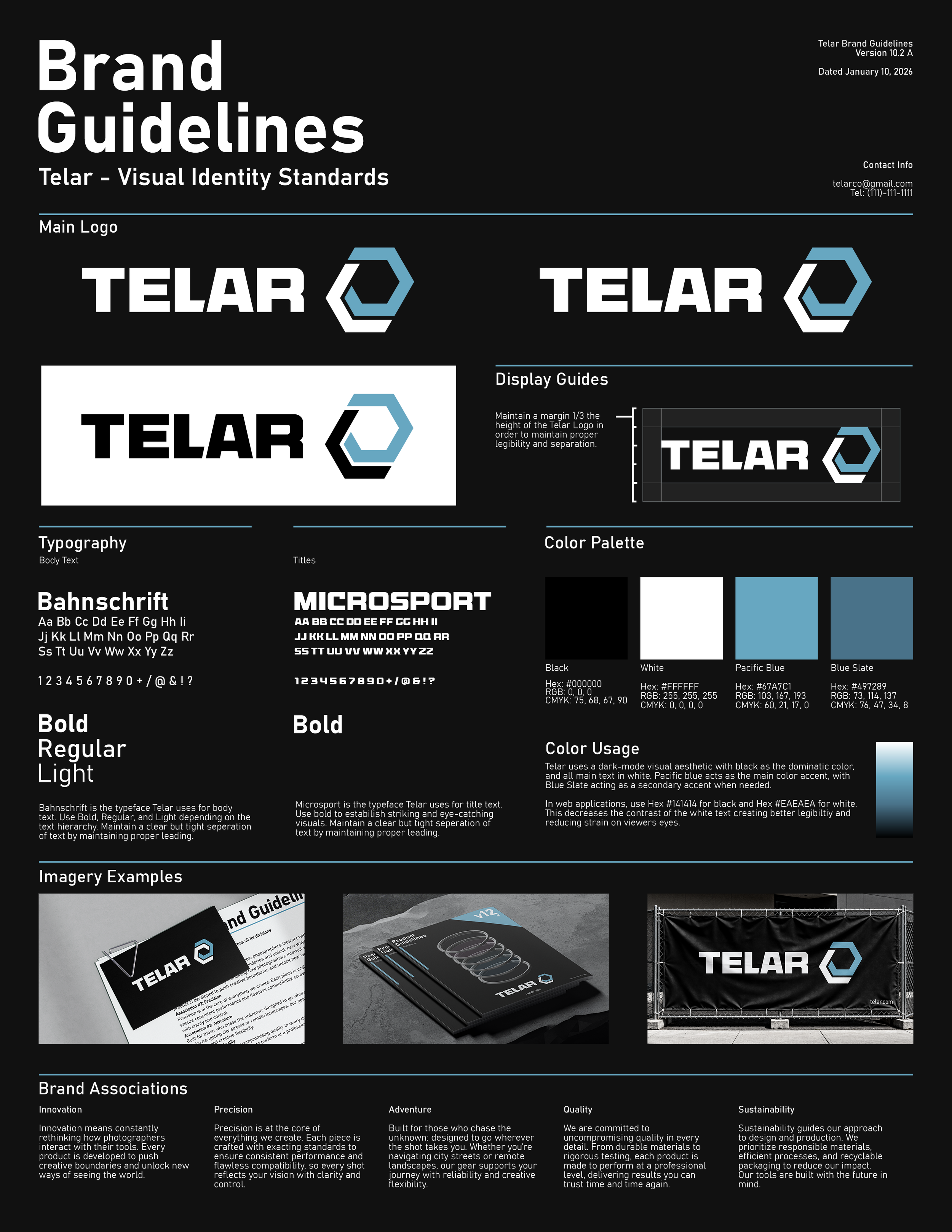
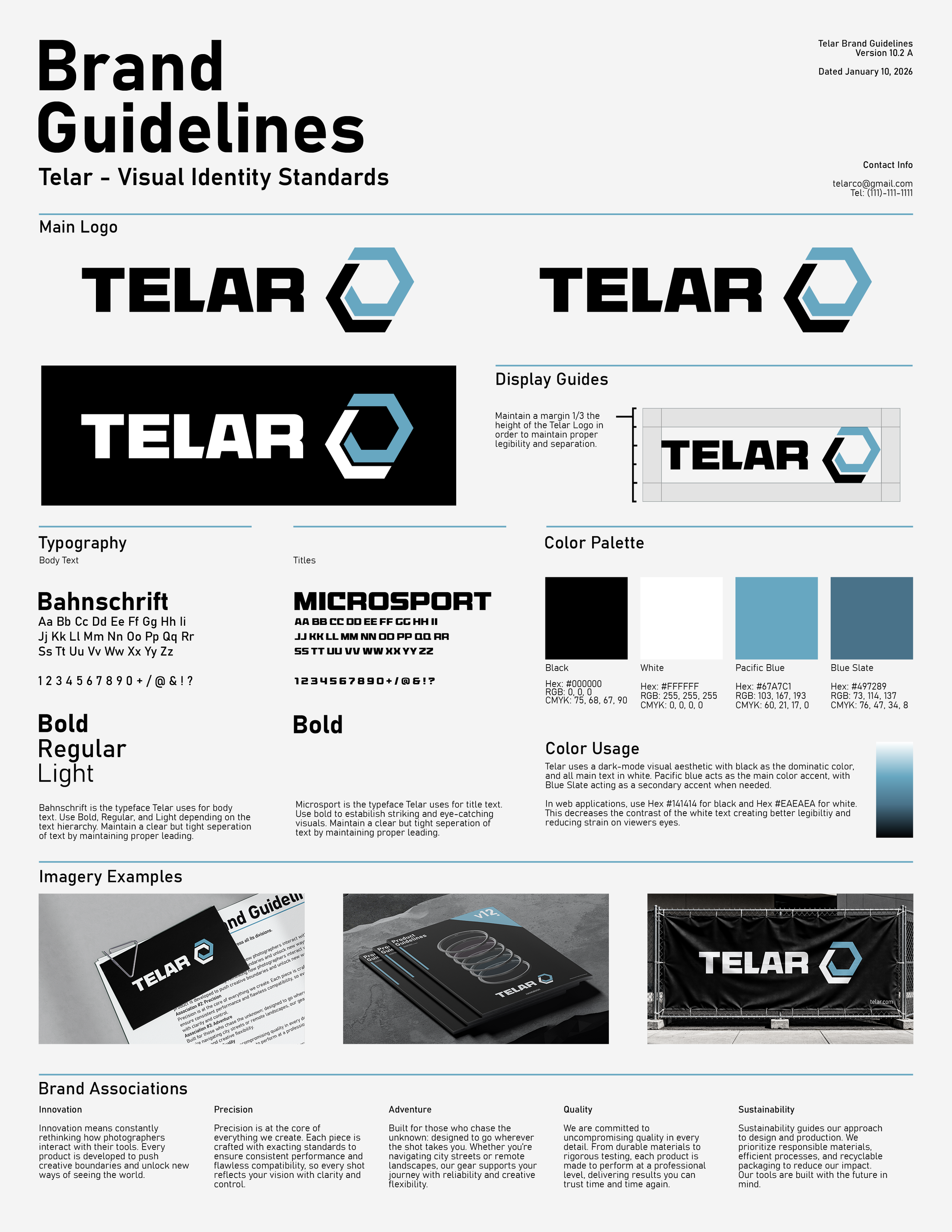
The design approach centered around creating a visual identity that reflects the precision and performance associated with professional camera equipment while maintaining a clean and contemporary appearance. The system shown in the brand guidelines was built around strong contrast, structured layouts, and restrained use of color. Black was established as the dominant foundation throughout the identity to give the brand a technical and premium feel, while the light blue accent color was introduced selectively to create hierarchy, draw attention to key elements, and reinforce recognition across applications.
Typography played a major role in shaping the brand’s tone. The combination of Bahnschrift and Microsport creates a balance between clarity and impact, allowing the identity to feel both functional and bold. Large geometric letterforms and tight spacing help establish a sense of confidence and durability, while the supporting type remains highly legible across packaging, documentation, and signage. The logo itself was designed using angular forms and a simplified hexagonal symbol inspired by optics and mechanical precision. Its structure allows it to remain recognizable at both small and large scales without relying on unnecessary detail.
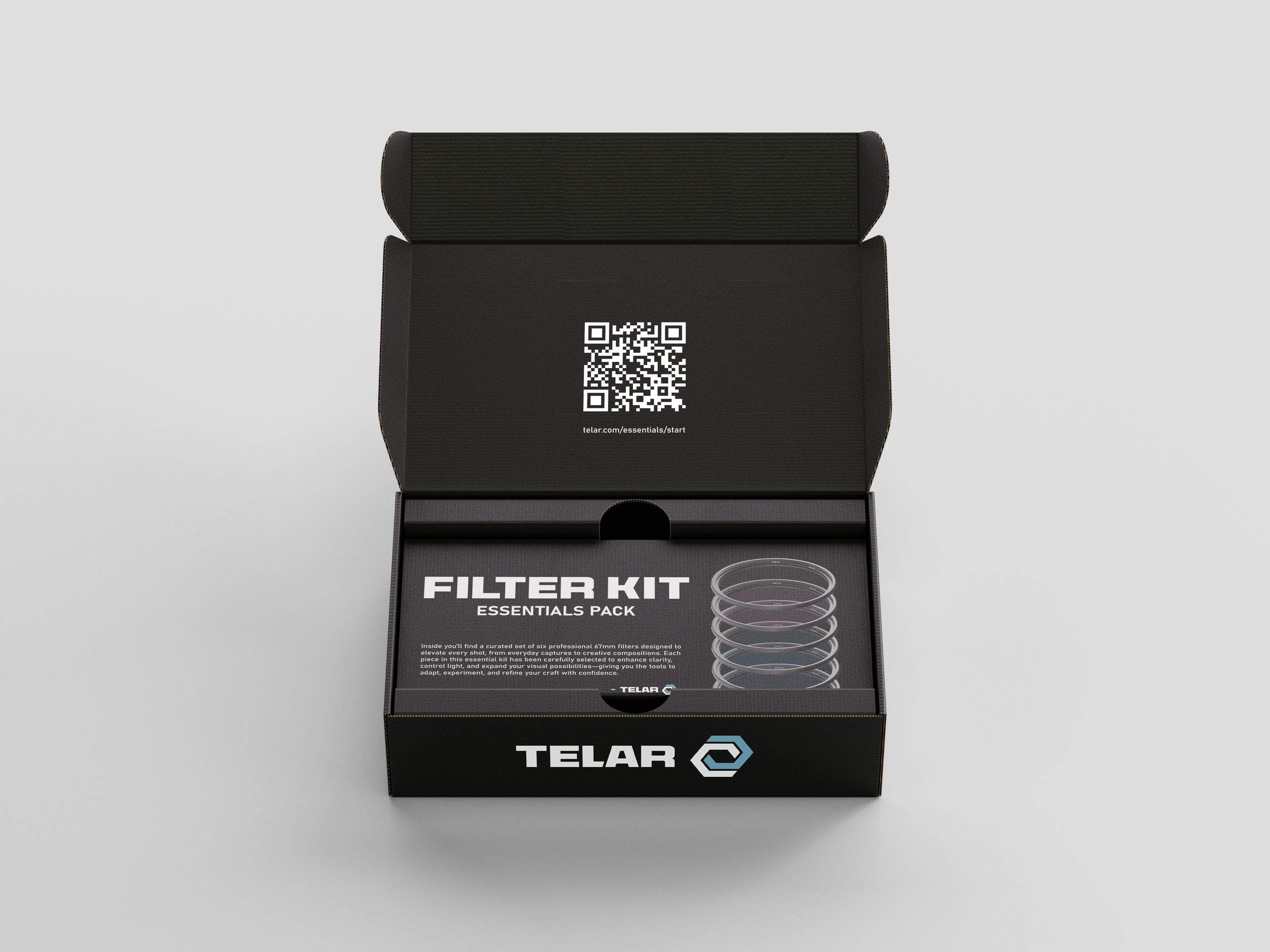
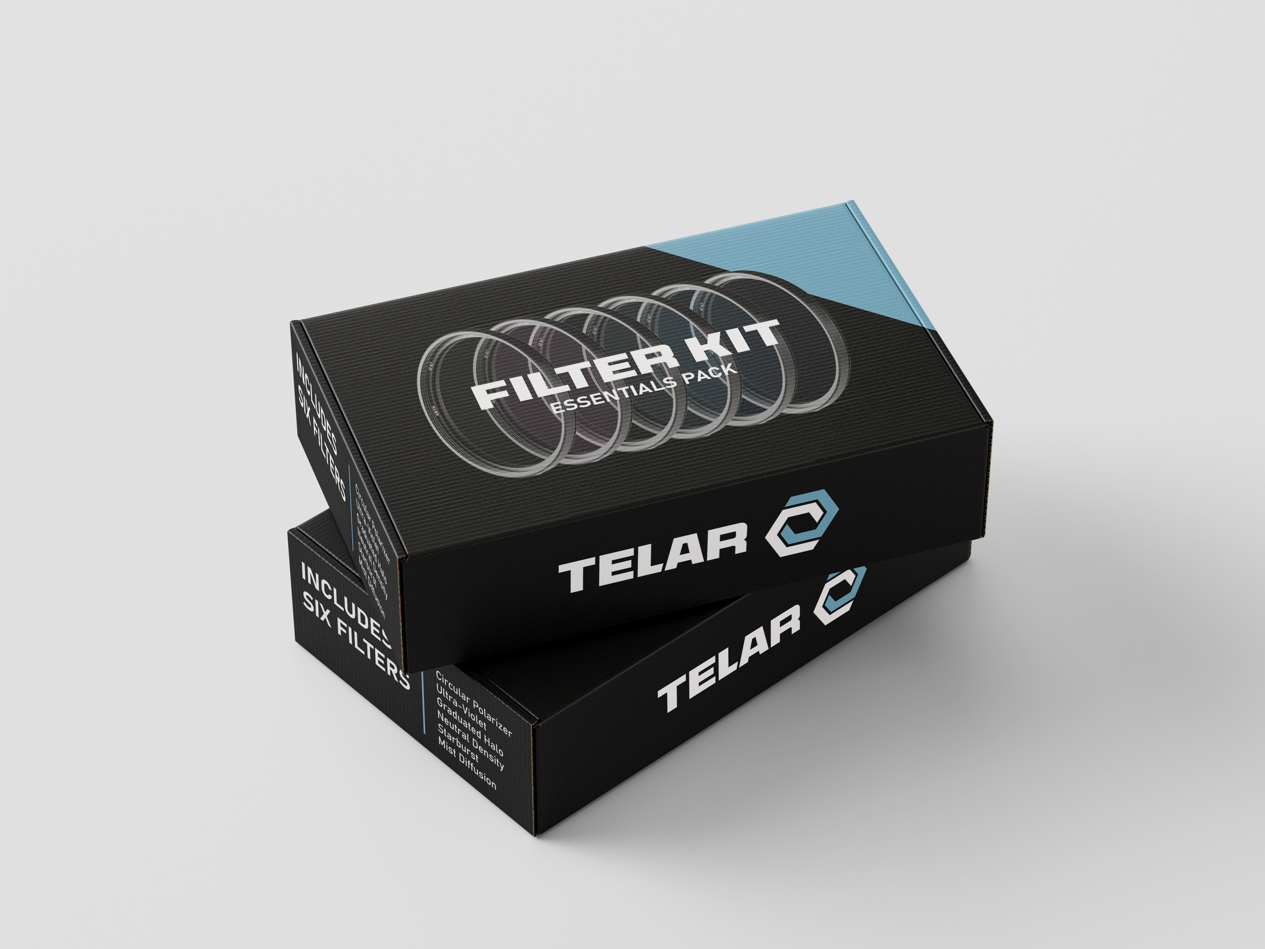
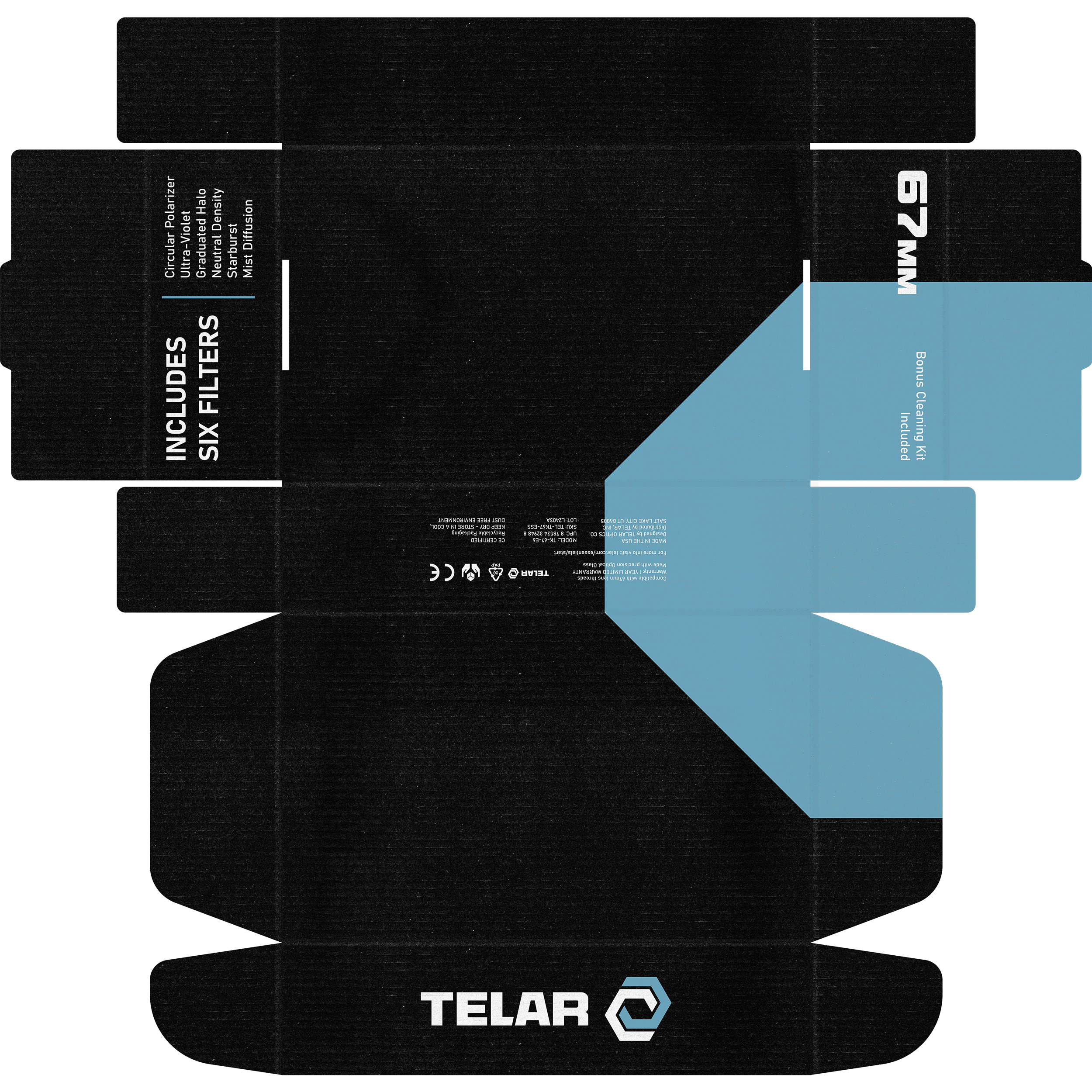
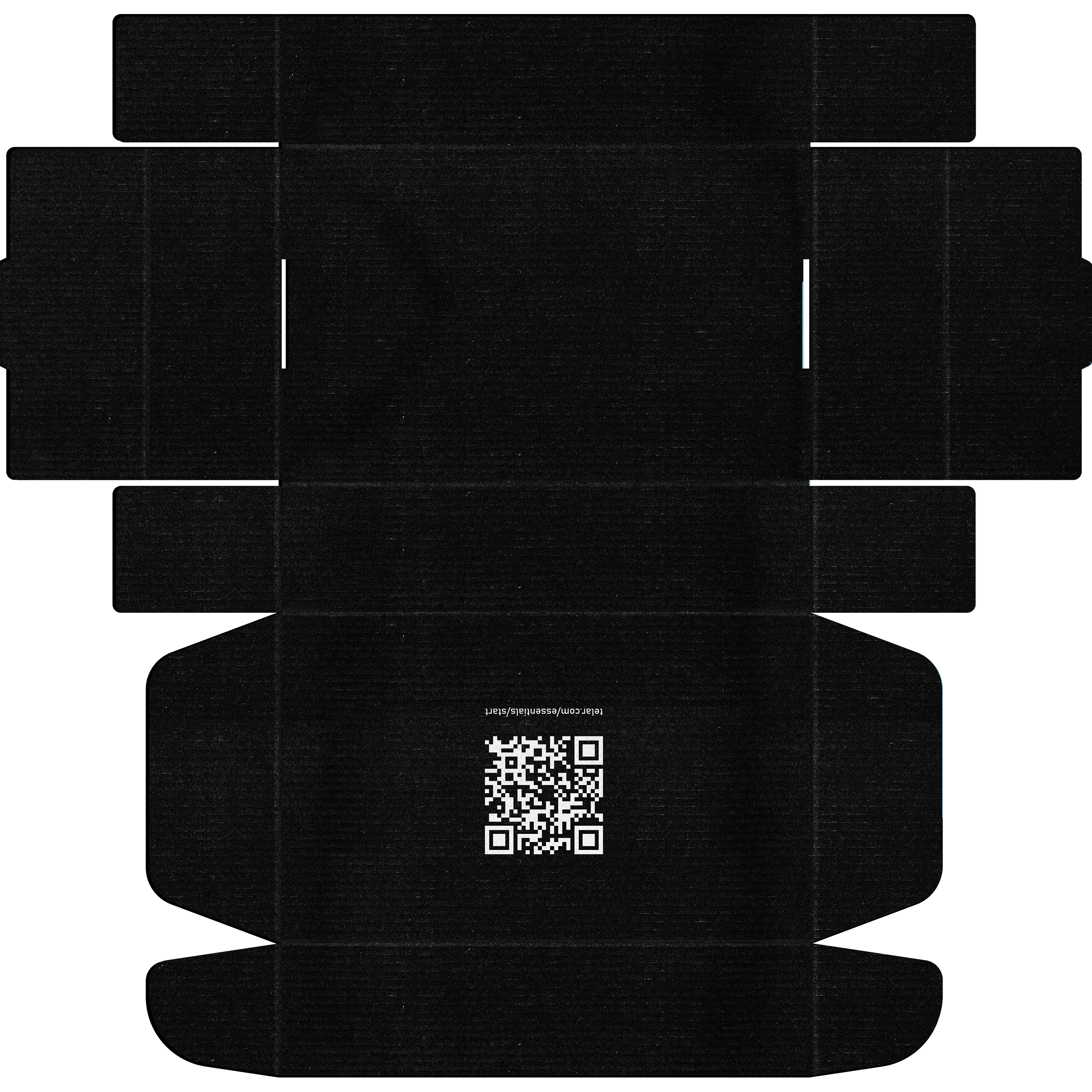
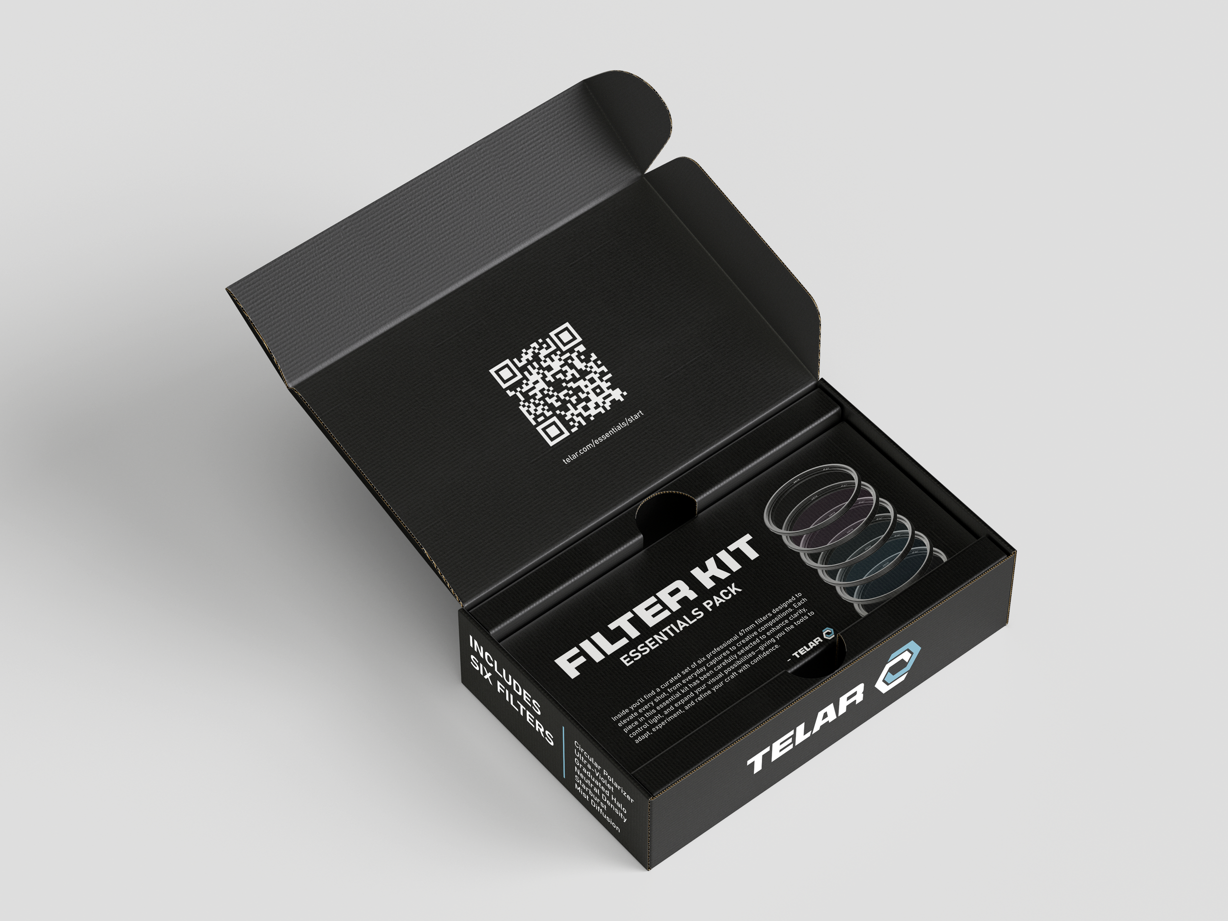
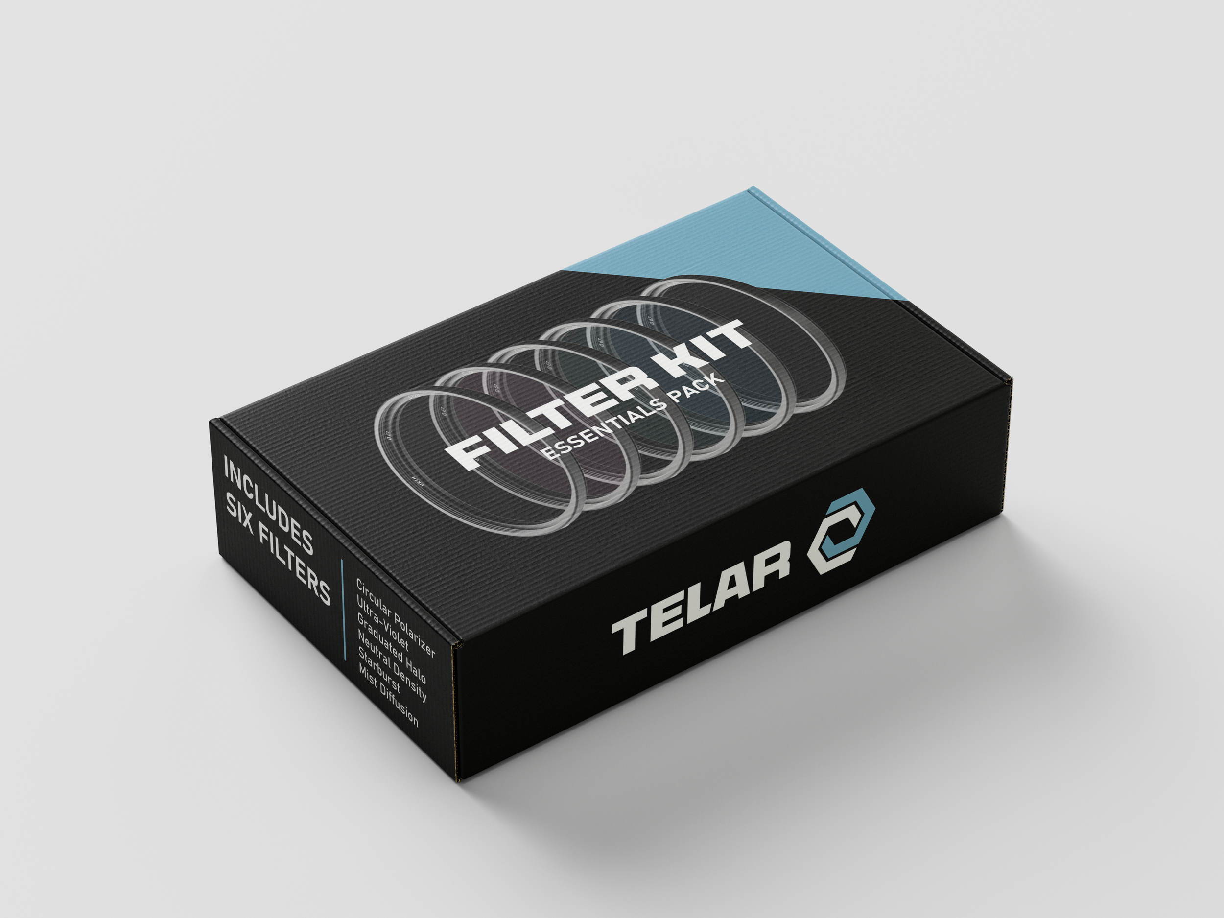
The packaging system was approached with the same level of restraint. Rather than overcrowding the layouts with technical graphics, the designs use negative space, minimal typography, and oversized product imagery to create a more refined presentation. Thin blue divider lines and consistent spacing systems tie the applications together and help maintain cohesion throughout the brand guidelines, packaging mockups, and environmental branding. The result is a visual system that feels modern and performance-driven while remaining flexible enough to extend across future products and brand applications.