XNDROPS
2026
About XNDROPS
This project is a rebrand for the Romania-based apparel & accessory brand XNDROPS.
Project Scope
Logo, Brand Identity, Mockup, Motion Graphics
The Challenge
The challenge of developing a rebrand for XNDROPS was to create a brand identity and logo that felt new and clean while maintaining the bold aesthetic the brand had built over the course of its lifespan. The new identity needed to preserve the character and edge that made XNDROPS recognizable while giving the brand a more refined and intentional visual foundation. It also needed to function seamlessly across a wide range of digital and physical applications without becoming overly restrictive or dependent on a single format. The goal was to establish a cohesive system that could support the brand as it continued to grow, remain recognizable across different applications, and provide enough flexibility to accommodate future expansion.

Design Approach
Designing a rebrand for XNDROPS began with an in-depth analysis of the brand as it currently stood. Careful examination was necessary to identify what made the brand unique and recognizable while also uncovering weaknesses in the existing branding and areas that needed improvement. This analysis revealed that the strongest and most identifiable elements of XNDROPS were its bold icons inspired by militaristic design language. Bold icons and lettering were reminiscent of the stenciled typography used throughout military applications, alongside motifs such as crosshairs, bullets, camouflage, stars, insignias, and more. A successful rebrand would preserve this tone while giving the brand a more refined and cohesive visual system. The primary weaknesses were the disjointed logos and inconsistent design language, coupled with an excess of visual elements that muddied the brand’s overall image. The rebrand therefore focused on creating a versatile identity that could function across multiple mediums while consolidating unnecessary elements and establishing greater longevity and consistency.
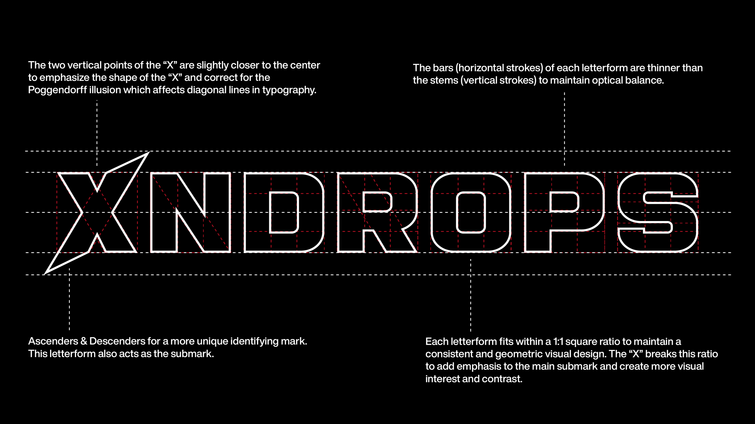
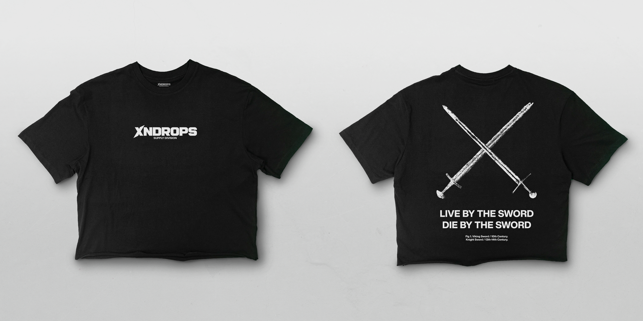
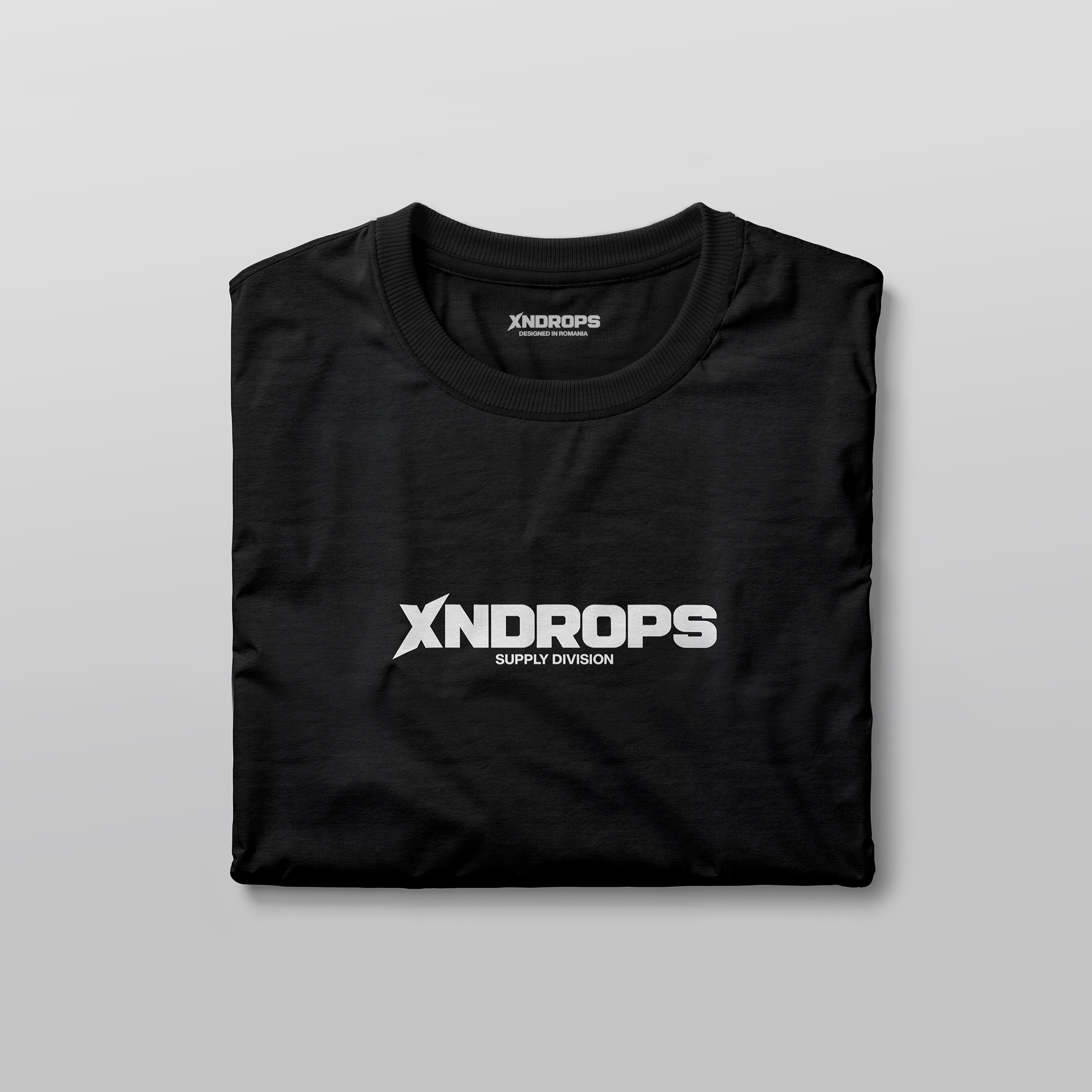
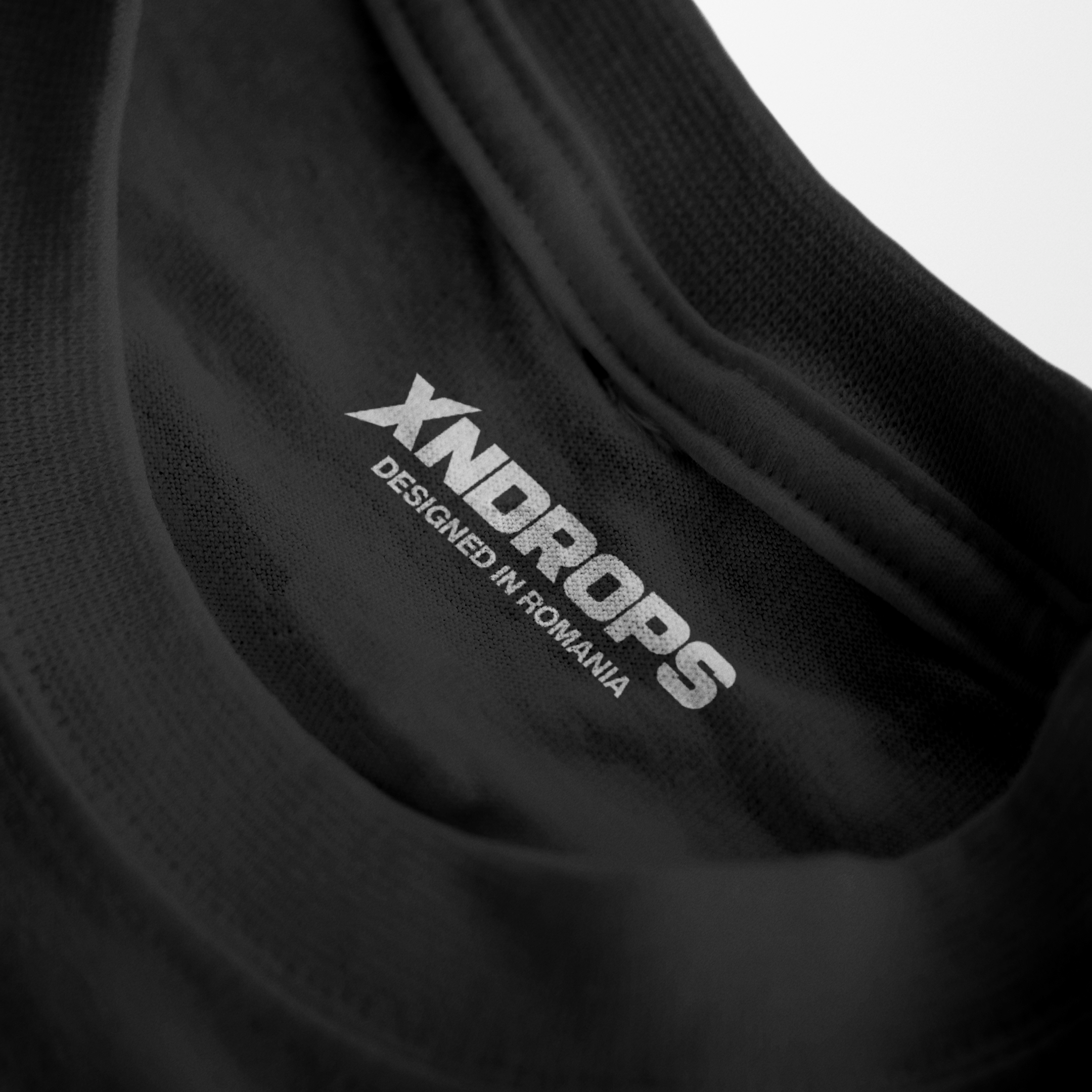
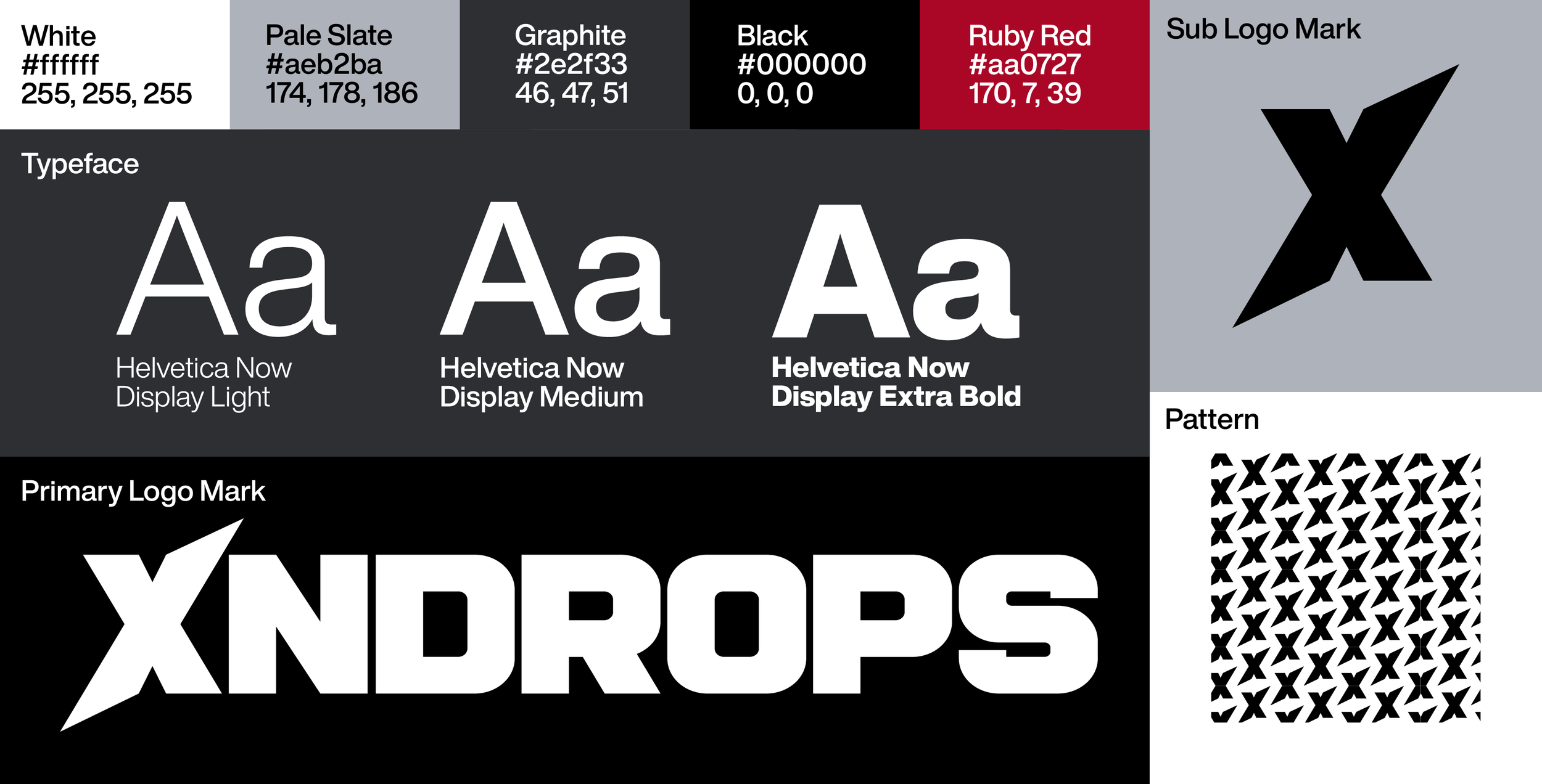
The new wordmark and primary logo were designed around the characteristics of stenciled military lettering. Although the small breaks typically found in traditional stencil typefaces were omitted, the letterforms retained the bold and geometric qualities necessary to communicate the same tone. Rather than relying on a premade typeface, the wordmark was designed from the ground up to create a unique and proprietary mark tailored to the brand’s needs. Each letterform was constructed within a 1:1 square to ensure consistent proportions and prevent distortion, particularly within the primary identifying “X.” The “X” was given ascenders and descenders to create a distinctive icon that could stand apart from the other letterforms while also functioning as the brand’s submark. This consolidated the various and inconsistent “X” designs previously used by the brand into a single, recognizable mark. Careful attention was given to the proportions and architecture of each letterform to ensure consistent optical balance throughout the wordmark.
Design Approach Cont.
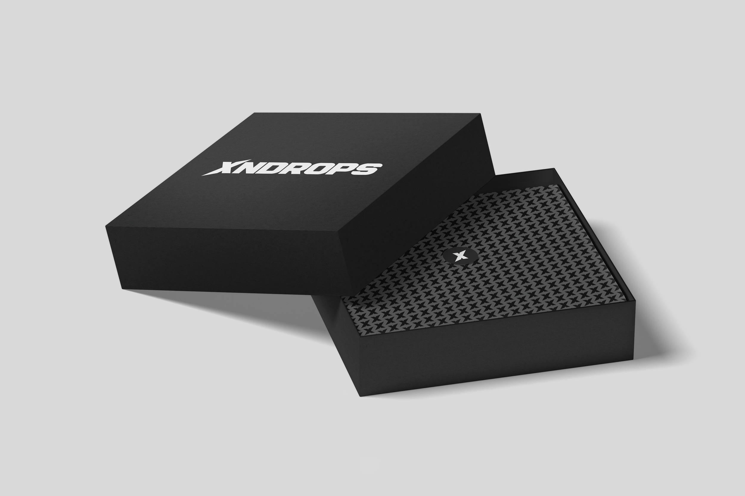
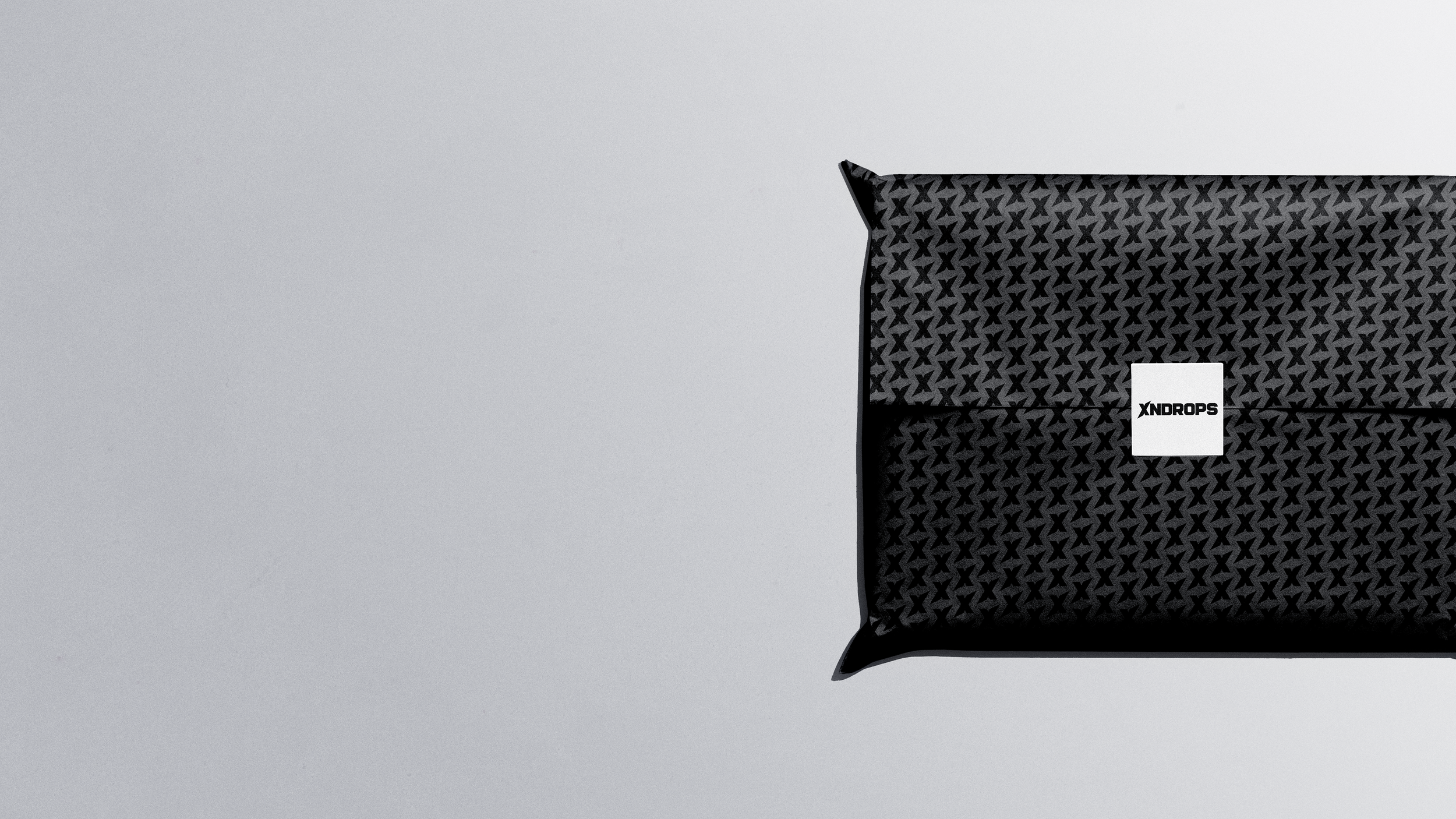
When designing the brand identity for XNDROPS, it was essential that the main logos could be versatile enough to operate efficiently across multiple mediums. With this in mind, the submark was duplicated and transformed to create a repeating pattern that fits seamlessly alongside the other logo designs. This pattern creates a clean visual noise optimized for packaging, wrapping, and subtle background detail.
A refined palette of five colors were selected for the brand’s identity. Firstly pure black and pure white: These colors were chosen for their minimal nature which reinforced the “darkwear” & stark silhouetted aesthetic the original XNDROPS brand developed. The brand guidelines outline proper usage, and other less-harsh colors to use when working in digital spaces. To support these colors and make them stand out, three more colors were picked: Pale Slate, Graphite, and Ruby Red. While Pale Slate and Graphite act as intermediate colors between black and white to smooth their transition and offer additional design choices, Ruby Red acts as a bold color minimally used to add emphasis & contrast to XNDROPS visual language.
Lastly, the sans-serif typeface Helvetica Now was chosen to complement the sans-serif type of the primary logo mark. Three variable weights were chosen to aid in hierarchy and legibility.